Dealicious
Product Design & Dev
Overview
Dealicious is a web platform that provides an effective solution for Food Hospitalities to create referral marketing campaigns and loyalty programs, leveraging data analysis and AI tools. Our goal is to empower these businesses by providing them with a comprehensive set of tools to enhance their marketing efforts and boost sales. By using Dealicious, Food Hospitalities can effortlessly create data-backed and customized referral marketing campaigns to attract new customers, while implementing loyalty programs to retain their existing customers.
Download Proposal-
 Impact
Collaborating on an agile team, we conceptualized, designed, and developed a responsive B2B2C web application that addressed a real-world marketing need. Usability testing of our MVP demonstrated how transforming complex analytics into actionable insights empowers small businesses to make data-driven marketing decisions.
-
 Hats Worn
- I led the design team, performed user research & market analysis & clustered data, crafted persona & user journey, created user flow & wireframes, communicated design rationales, moderated usability testing & UX writing, designed illustrations, style guide, UI kit, and high-fidelity mockups.
-
 Tools
Tools
Adobe Tools(Ai, Id, Ps, Ae) & Figma for Design - Jira & Slack for PM
-
 Timeline
12 Weeks, from Ideation to Presentation
-
 Team
Team
3 UX/UI Designers
4 Full-stack Developers -
 Platform
Responsive Web App, SaaS
Empathize
Over 97,000 restaurants with $85 million annual sales in Canada prove that this is an attractive market, however, 8 out of 10 new restaurants fail within 5 years. These businesses often struggle to utilize marketing tools due to their complexity and cost. We interviewed a focus group to have a better understanding of the needs of food hospitality businesses. Integrating these interview reports with firsthand knowledge of the challenges faced by family-owned restaurants, we summarized the main pain points in the marketing section to be addressed:
- Marketing is a serious challenge for these businesses, and they need to stand out in a competitive market.
- During high seasons, although the number of customers sees a peak, it’s not always beneficial for the businesses, since they don’t have any control over the menu items which are mostly ordered.
- During low seasons, they need to utilize marketing tools to attract new customers. These tools include Facebook ads, subscription-based platforms, and generic review platforms. However, business managers are unable to measure the accurate success of each tool.
- Another approach for increasing visibility is influencer marketing. However, it's time-consuming and costly for small restaurants. Managers must find influencers, negotiate, and commission ads, yet KPIs remain untrackable, making it difficult to measure success.
- Word-of-mouth is another existing alternative. Although it is a powerful marketing tactic, it is barely considered a marketing tool, because it’s not trackable.
Small restaurants face marketing challenges due to high costs, complex tools, limited time, and difficulty tracking the success of campaigns, especially during low seasons.
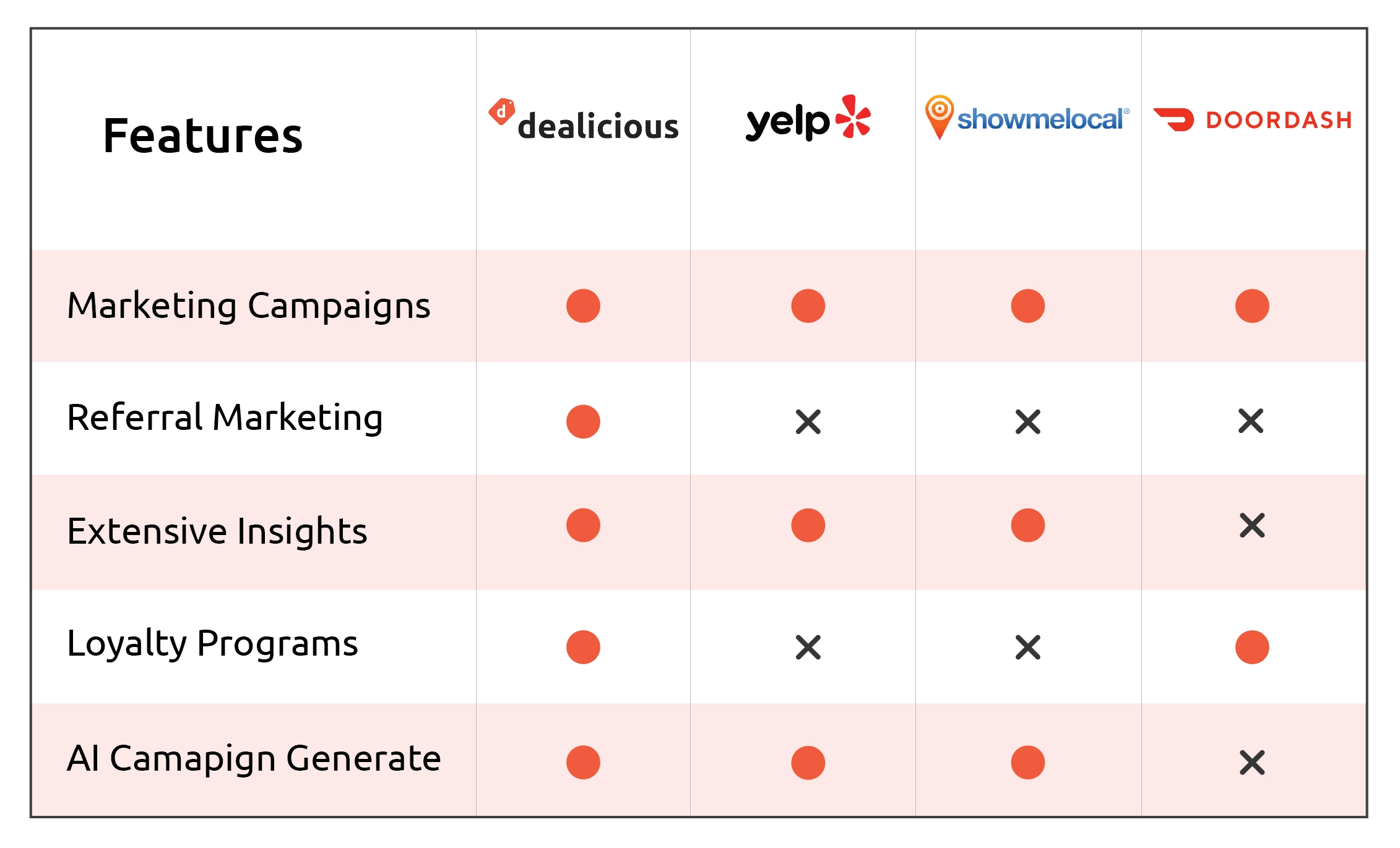
Market Research
Some platforms in the market offer similar features, but none include a referral program, and two lack loyalty programs. Dealicious differentiates itself further by leveraging accurate insights and AI to stand out.
Persona Research

I've got big dreams but a small budget. I wanna find smart moves to make my restaurant shine.
34 Years Old
Highlights
- Occupation: A skilled chef who launched her own small restaurant and is determined to grow it.
- Tech familiarity: Relatively tech-savvy, using web applications for marketing her business.
Applications
 Uber Eats
 DoorDash
 Google Maps
 Yelp
Yelp
Core Needs
- Business Growth: She needs efficient data tracking and visualization tools to make informed decisions and grow her restaurant.
- Efficient Marketing: Effective targeting helps her invest in marketing tailored to her ideal customers, making better use of resources.
- competitive Advantage: Identify and implement unique selling points or strategies that set her restaurant apart from competitors.
Frustrations
- Marketing Channels: Her investments on advertisement and Influencer marketing don’t pay off.
- Customer Retention: Despite high quality food and service, she can not retain her customers.
- Attracting New Customers: She finds it challenging to attract customers who rely heavily on online reviews and recommendations.
To empathize with the real users and look at our solution through their motivation lens, we created user stories for our main personas:
As a Restaurant Owner
- I want to easily create Loyalty Programs so that happy customers keep coming back
- I want to keep track of performance of marketing campaigns so that I make better marketing decisions
- I want to easily create effective marketing campaigns so that I attract and retain customers
- I want to have more customer reviews
As a Food Lover
- I want to try new places and food with a discount
- I want to sign up so that I can get points every time I spend money, at a restaurant
- I want to share the joy of discovering new foods with my close friends and try something new together
- I want to earn points and discounts, every time I refer this restaurant to my friend
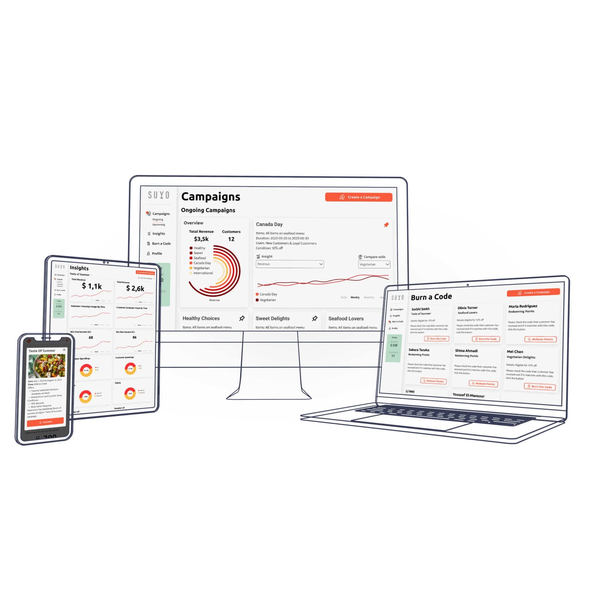
Main Features

Referral Marketing
Dealicious empowers small dining businesses to create targeted marketing campaigns with ease. Its AI generator supports owners in developing special offers to attract new customers and re-engage existing ones. Each establishment gets a unique QR code, enabling customers to register and refer others directly through the Dealicious platform.

Insights and Analysis
Dealicious provides business owners with data analysis and insights into campaign performance, tracking revenue, engagement, and conversion rates. This approach helps optimize strategies for better results. Owners can compare current and past campaigns to see what works, refine their efforts, and improve overall marketing effectiveness.

Loyalty Programs
Dealicious strengthens customer retention with a loyalty program that rewards existing customers. Registered users become Super Customers who share experiences and earn redeemable points for successful referrals. This fosters loyalty, drives repeat visits, and helps food businesses build lasting relationships that fuel revenue and positive word-of-mouth.
Defining Principles
To form a shared understanding among the team, we discussed the principles of the application including:
- How referral system works?
- How new customers are converted to super customers?
- How the pointing system works?
- How new and super customers can use an ongoing campaign's offer?
- How restaurants can accept an "Activate Campaign" request?
- How the metrics can be accessed and calculated?
- How to show the metrics for better engagement and understanding?
- Which demographic data are needed to create better campaigns, without violating customers' privacy?
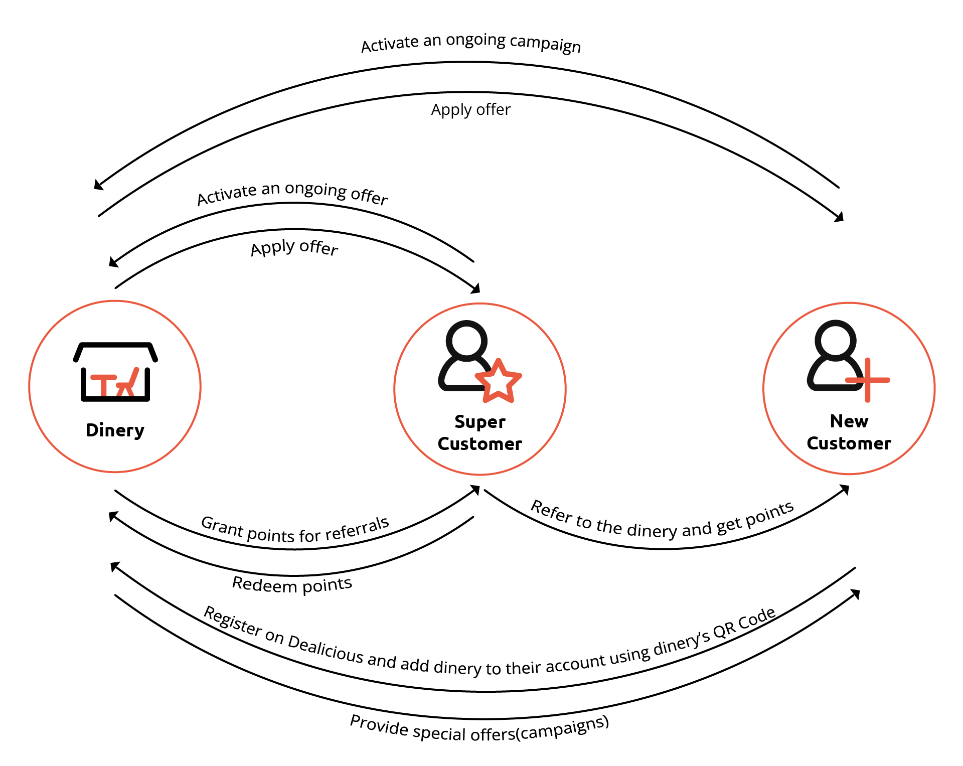
User Flow
The user flow has three sections: the business owner manages campaigns and insights, loyal customers refer others and use rewards, and new customers explore campaigns and can become super customers.
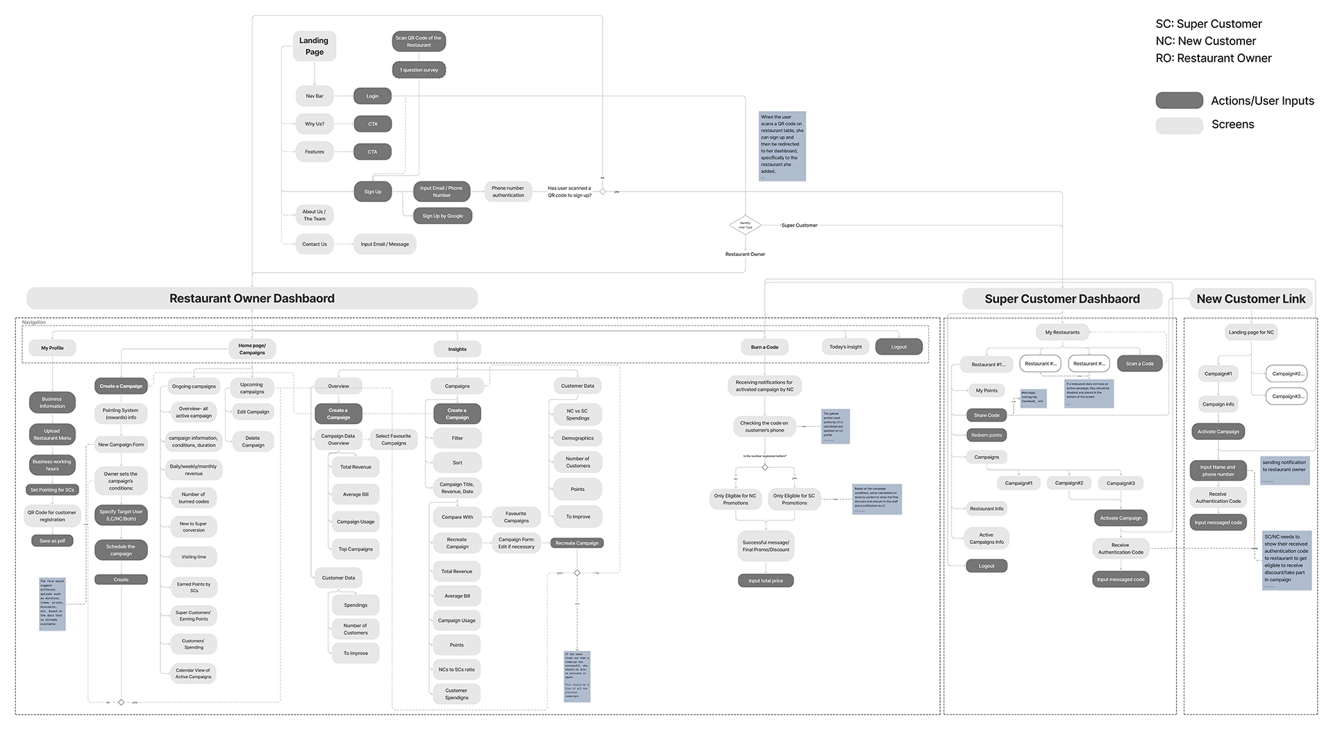
Wireframe
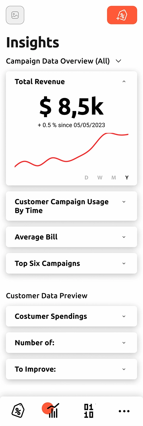
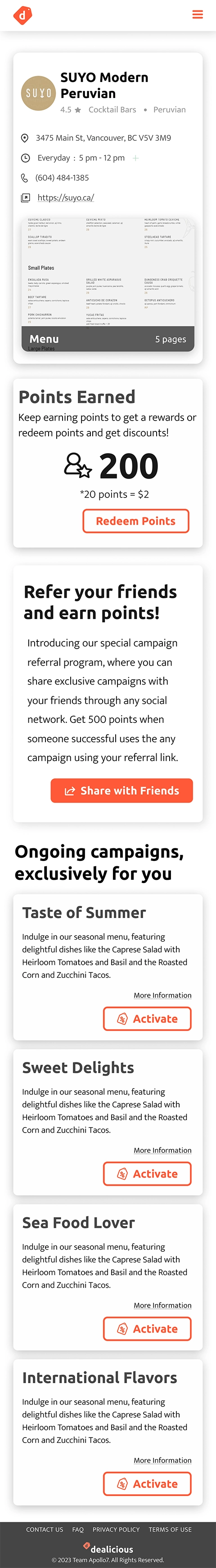
After confirming the user flow in team meetings, we iterated on wireframes, adjusting flows and information architecture for better UX. The final version included developer annotations for clarity. We designed mobile and desktop views simultaneously, focusing on desktop for the business owner and mobile-first for customers based on personas and use cases.
Based on the user flow and modified features, the wireframes are categorized as follows:
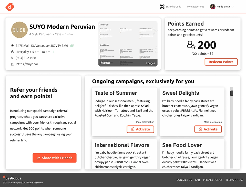
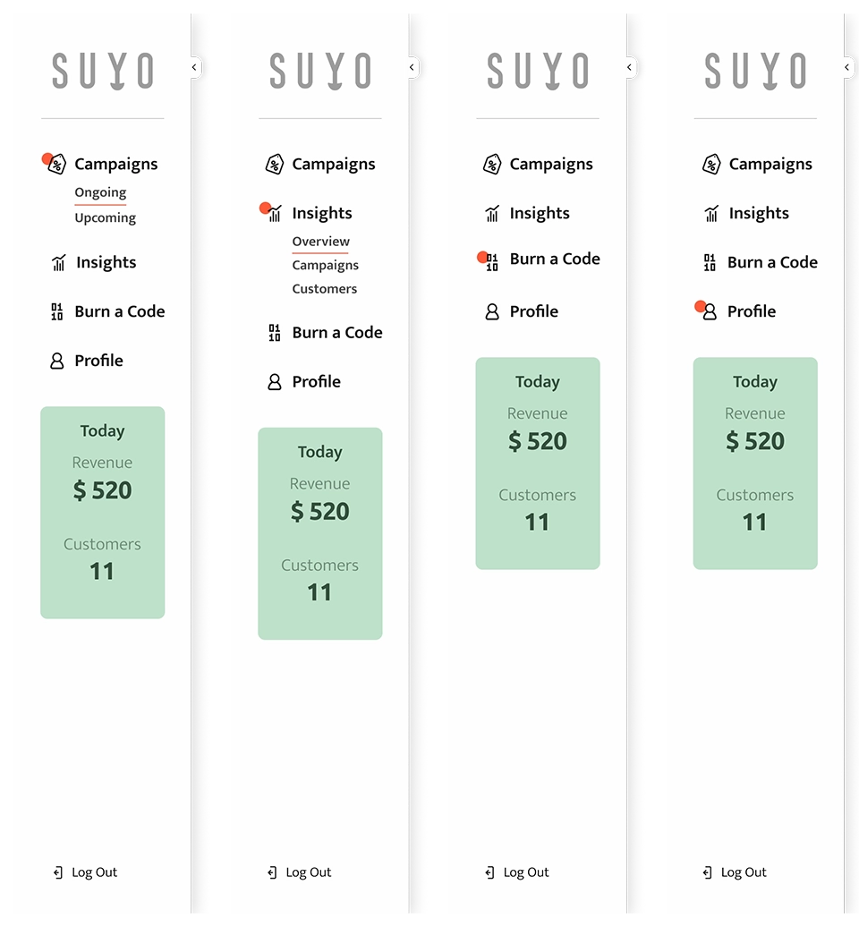
- Restaurant Owner Dashboard; including Campaigns, Insight, Burn a Code, and Profile
- Super Customer Dashboard; including My Restaurants, Restaurant Single-View, and Profile
- New Customer Dashboard; including Restaurant Single-View
Campaigns Flow Iterations
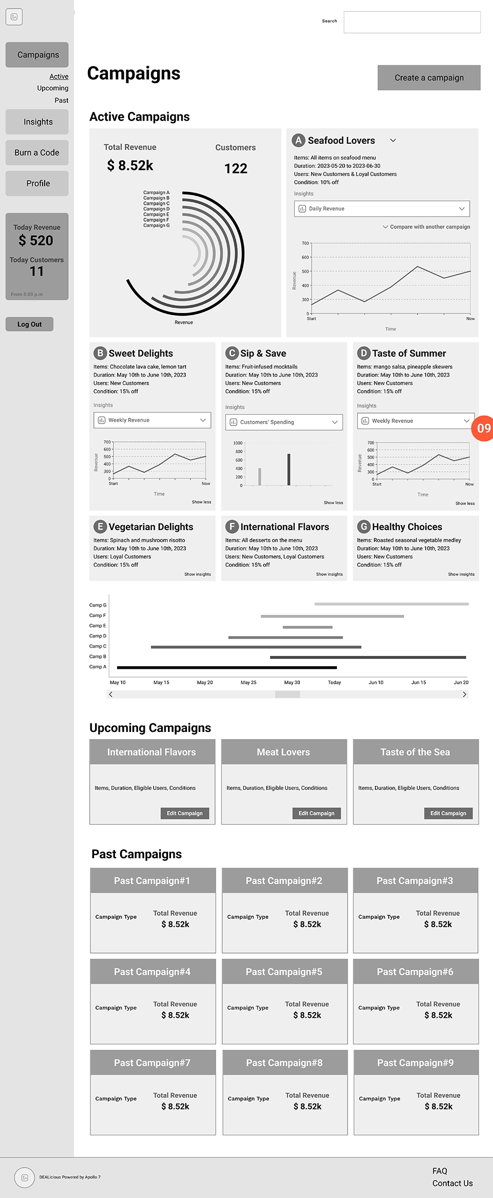
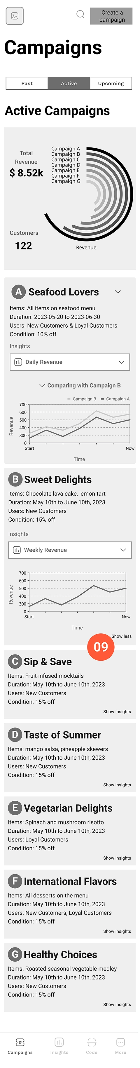
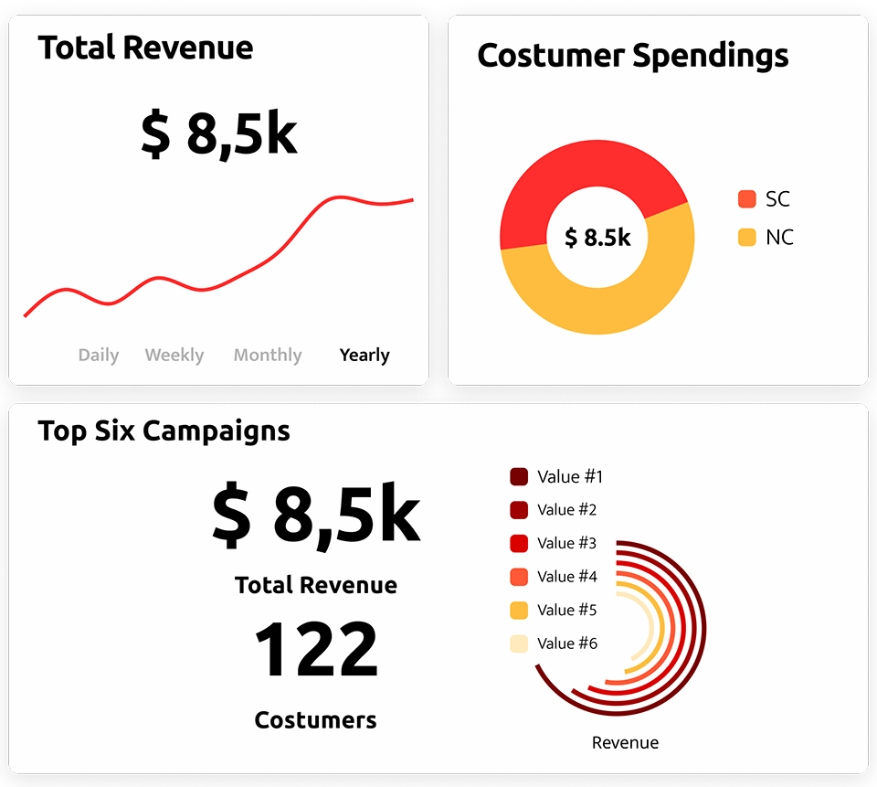
The Campaigns page, the home screen of the Restaurant Owner Dashboard, lets users track marketing campaigns. Initially divided into Ongoing, Upcoming, and Past, we moved Past into Insights to keep focus on current activity for better decision-making. Each campaign had cards showing basic info and charts for data-driven insights.
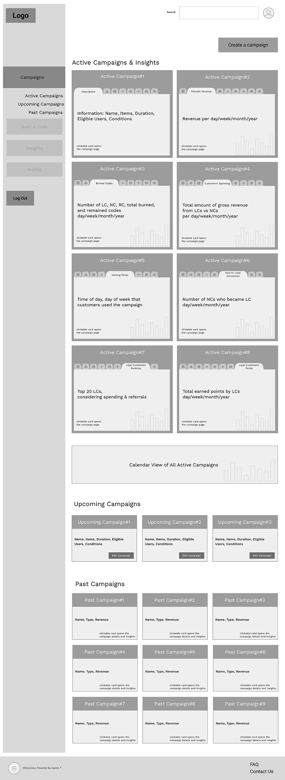
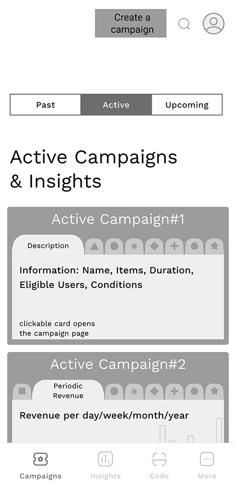
To handle numerous data and ensure a fat-finger-friendly mobile design, we replaced tabs with a dropdown menu. Expandable cards now show charts only when expanded, keeping the home page clean. The featured campaign and top comparative chart allow users to see the most important data at a glance without extra clicks.
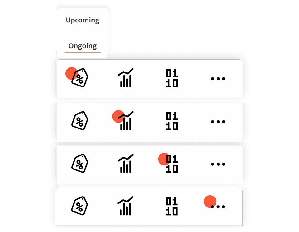
Ongoing campaigns with cards in their default state:
Ongoing campaigns with cards in their expanded state:
Wireframe Annotations
- Tab navigates to a heading in the same page
- Navigation resembles application nav bar and is sticky at the bottom of viewport
- Searching among the campaigns for specific campaign type
- All campaign overviews(active, upcoming and past) are in the same page and these links navigate through the same page
- A comparison between all active campaigns
- Dropdown selects campaign. when a campaign is shown on highlighted section, it is removed from bottom section
- Insight selector- Dropdown selects the insight
- Compare opens a dropdown with a list of radio buttons to select the second campaign to compare
- Arrow expands the card to show full-size card including info, insight selector and insight chart
- Scrollable to the right and left to see all active and upcoming campaigns
- Button navigates to the form-view of the campaign to edit
- Sidebar is collapsible and it’s sticky while expanded
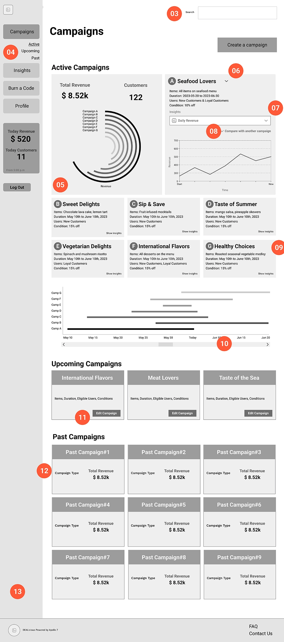
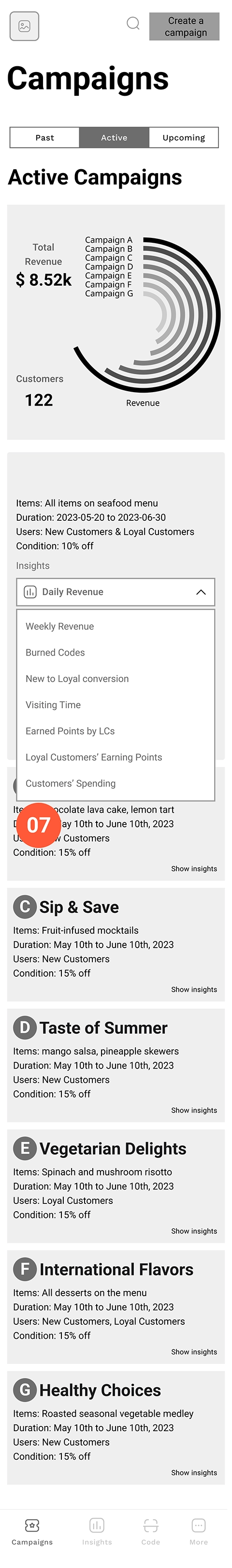
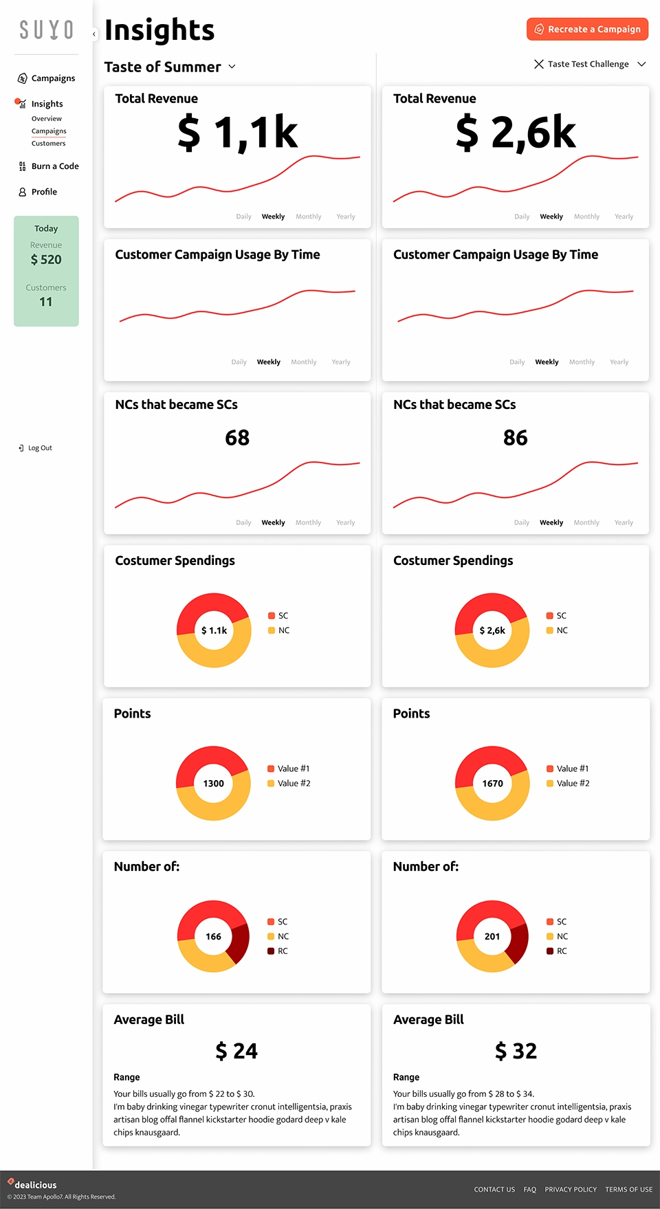
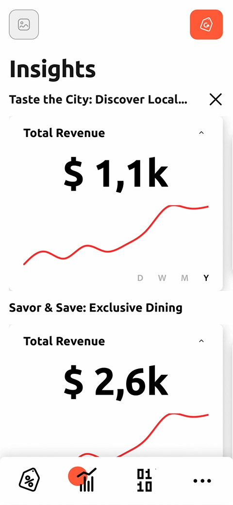
In the final high-fidelity wireframe, we added pins to campaign cards, making the featured campaign visually identifiable and reducing the need for a dropdown. Users can compare ongoing campaign metrics side by side, and view two selected campaigns on a single chart for better understanding of marketing performance.
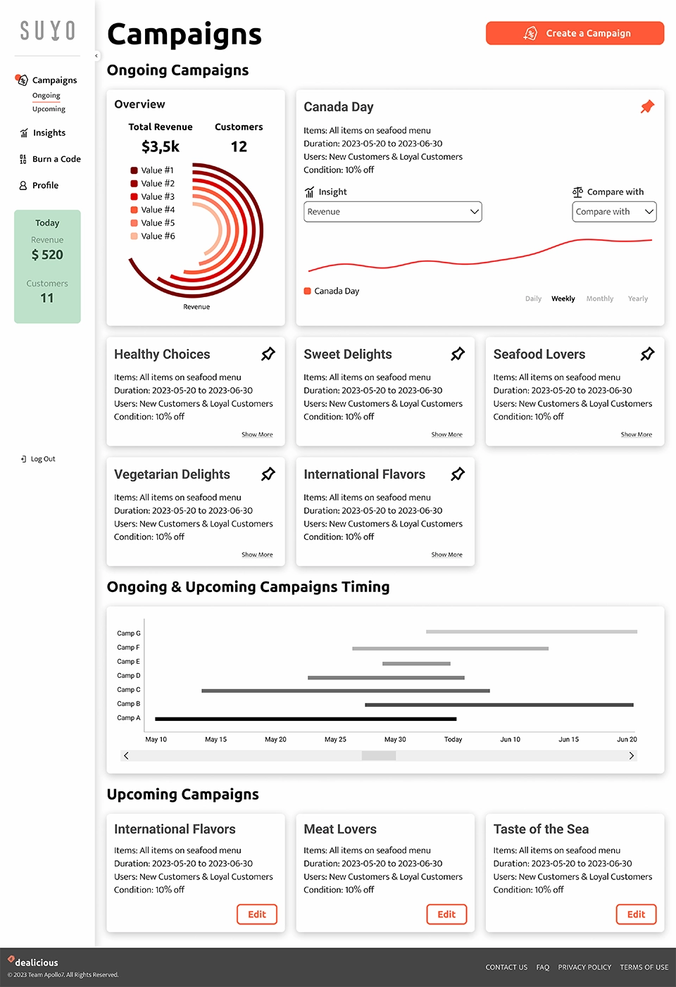
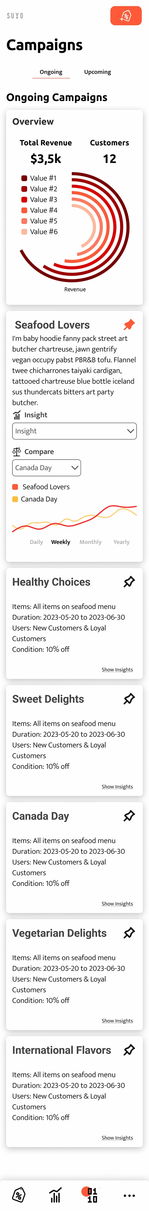
Pinning campaigns enables quick decisions by comparing two campaigns at a glance.
Insights Flow
The Insights section helps business owners make data-backed marketing decisions. They can view campaign and customer insights, compare past campaigns on revenue and retention, and replicate successful strategies.
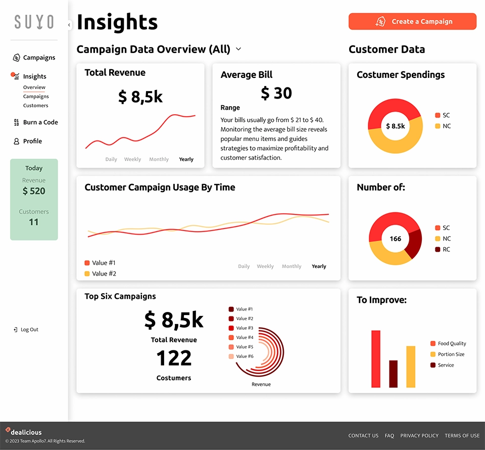
On the other hand, they can create special offers for their special customers, based on Customer Insignts. Moreover, they can compare each two previous and/or ongoing campaigns, in this section. Comparing metrics are shown side by side on desktop view, and top bottom with horizontal navigation on mobile view.
Super Customer Flow
Super customers are the ones who have registered on Dealicious through a restaurant's QR Code. On this page, they can view all their information in relation to that specific restaurant. They can apply to redeem their points, activate an ongoing campaign, or refer a friend.
Branding
Dealicious, a fusion of ‘Deal’ and ‘Delicious,’ reflects the platform’s promotional potential and delightful culinary experiences. The simple logo with a soft-edge typeface and special-offer symbol reinforces the brand’s memorable and approachable identity.
The primary orange represents energy and creativity in dining, evoking warmth and appetite. The secondary green symbolizes growth, profit, and healthy elements. Color variations are used in data visualizations to clearly differentiate metrics.
Headings use Ubuntu Bold, whose rounded, modern style adds a contemporary, friendly touch. Body text is Mukta Light, ensuring clarity and legibility.


UI Kit
Icons
Icons represent the main features, as well as other functions. They are used in two sizes across the website: 24px and 40px. Icons are shown in black on the platform in all cases, but for two conditions:
First, on navigation menus, where the active navigation menu has a background circle in the primary color. Second, the pin icon on the pinned cards which changes to the primary color.
Navigation
On the large screen in Restaurant Owner Dashboard, navigation is a fixed sidebar, placed on the left, and occupies 100% of the viewport height. On the form pages such as Create Campaign and Profile, the sidebar is shown collapsed to minimize distractions. On the mobile screen, navigation is fixed at the bottom.
When a nav item is selected, the background circle drops behind the active icon, in all screen sizes.
Cards
We designed a modular web platform using cards, structuring content and functions into self-contained units. This approach offered flexibility, scalability, and easy maintenance, while enabling consistent design and individually styled, visually appealing cards.
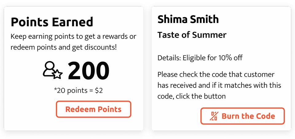
Chart cards come in three sizes—1-column, 2-column, and 1.5-column, for regular, pinned, and comparison insights. Charts vary by data type, including line, pie, bar, radial bar, and figures.
Buttons
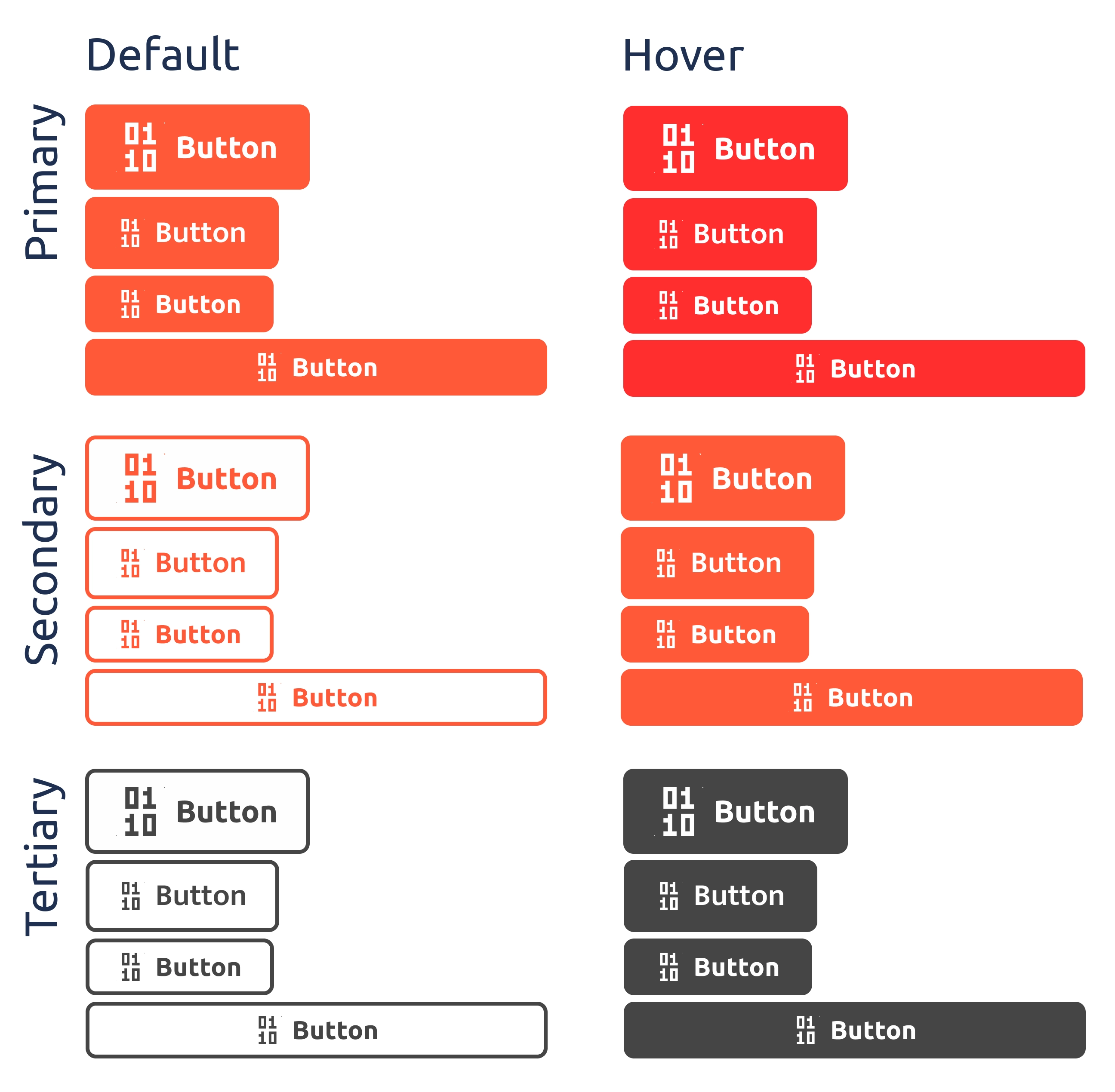
Primary buttons are used for the primary actions such as “Save”, “Create”, and “Submit”. Secondary buttons are used for primary actions which are repeated on a page such as “Activate” and “Burn the Code”. Tertiary buttons are the alternative to the primary action, “Cancel” for instance.
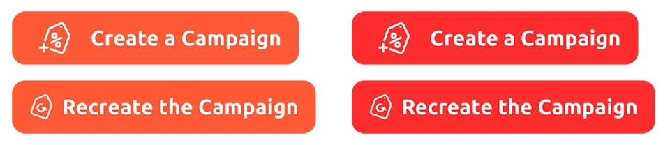
The “Create a Campaign” and “Recreate the Campaign” buttons have a specific design and top-right placement across the site. Also, the icons on these two buttons display continious micro animations.
Reflections
Lesson Learned
- Documentation is a lifesaver:
The importance of meticulous documentation became evident as the project progressed. Clear documentation facilitated smoother collaboration among team members, especially minimized friction among design and development teams. Having annotations on the wireframe and a design system, reduced the interpretations and contributed to a final product that was consistent and aligned with the design to a good extent.
If We Had More Time
- Design and development of POS Integration:
For a data-driven application increasing raw data leads to more accurate insights and improved marketing decisions. The MVP utilizes data solely from user input related to app campaigns, which may be impacted by human errors. To enhance data visualization and user experience, integrating Dealicious with existing POS systems in restaurants is suggested, supporting more reliable data collection and analysis.
See More of My Work
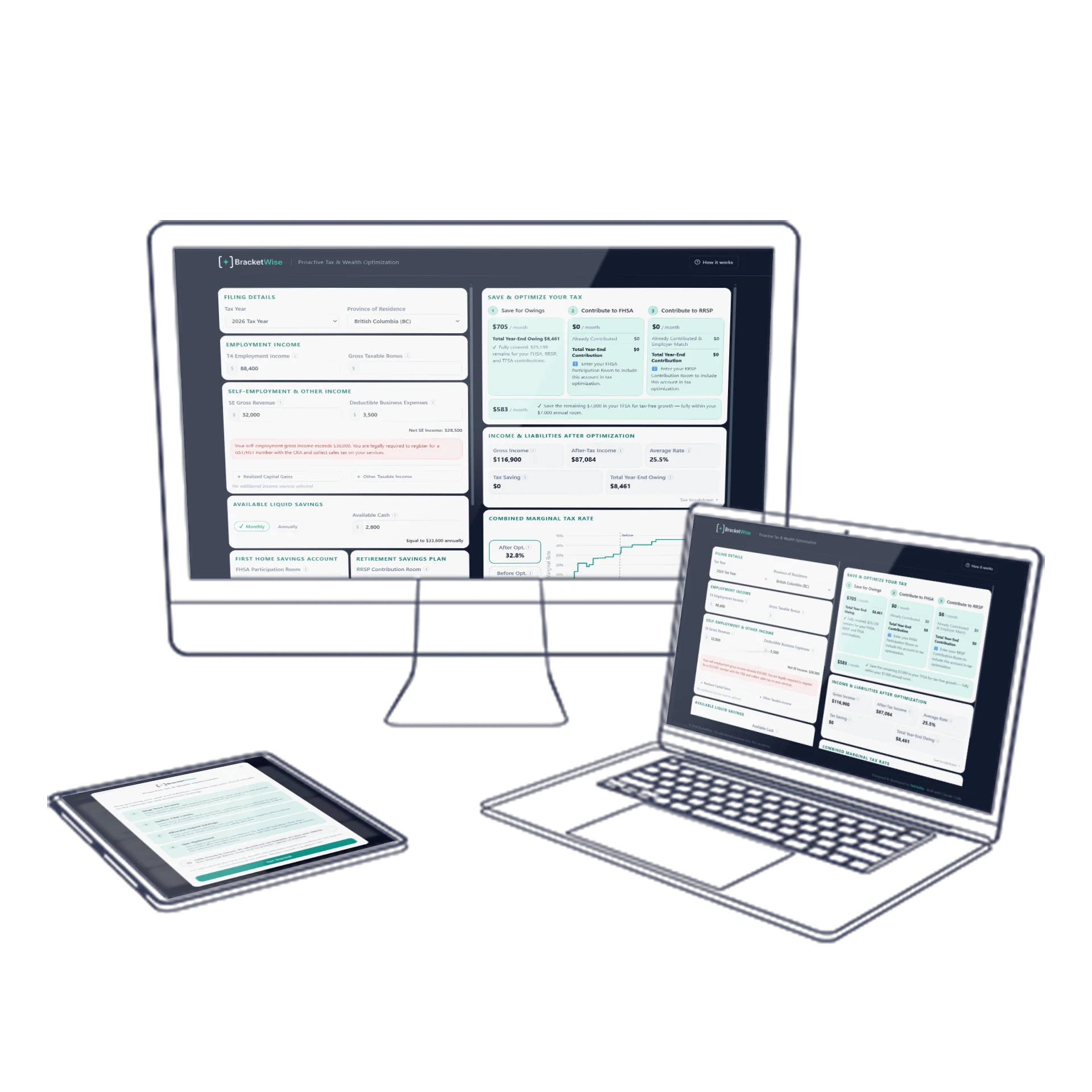
Tax Optimization SaaS
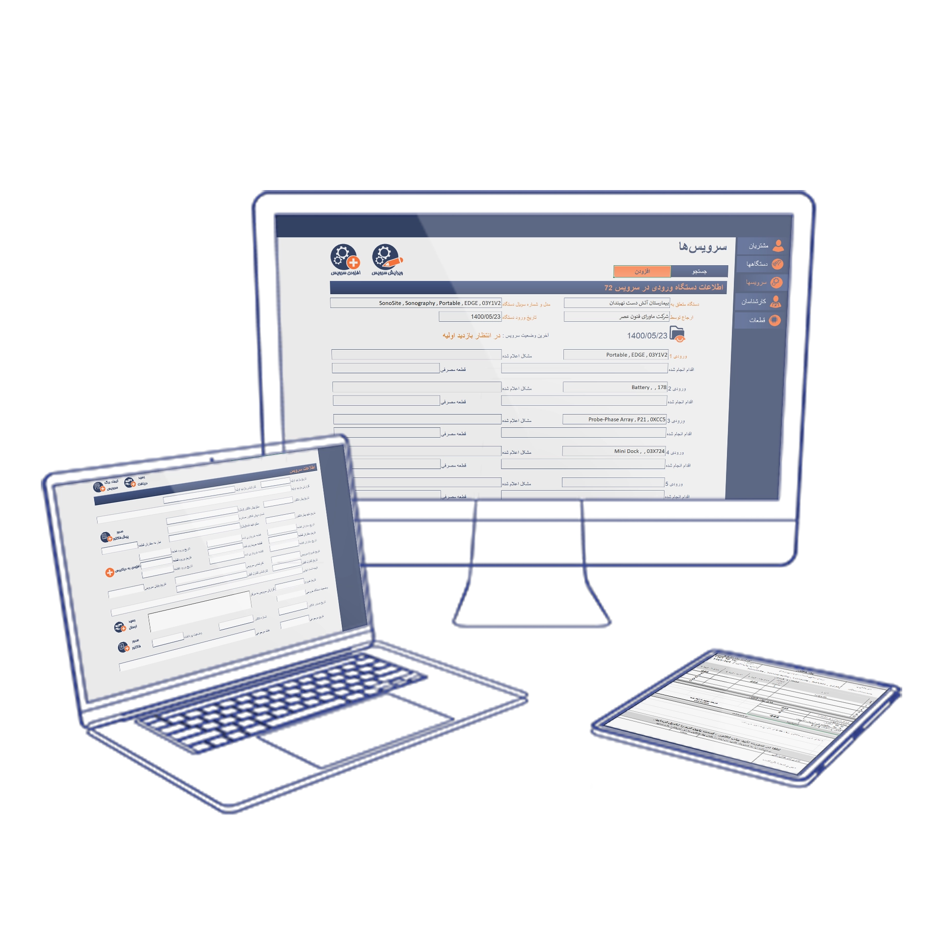
Enterprise Service Design
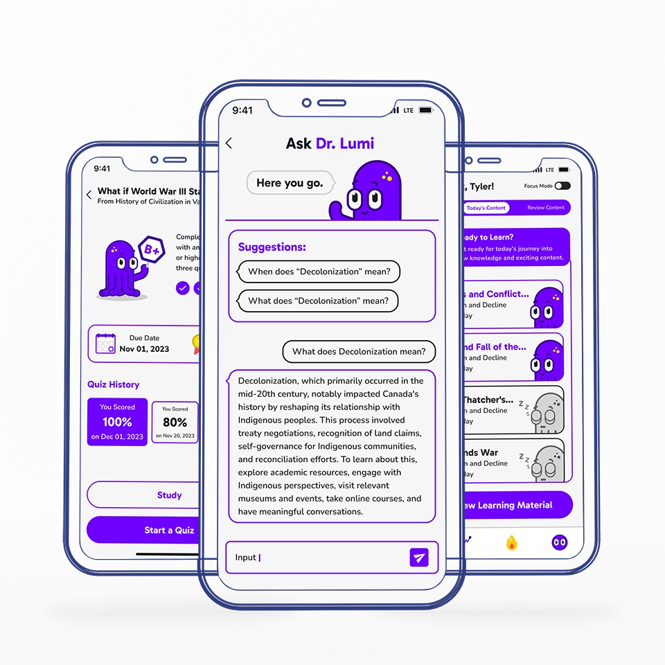
Mobile App Design
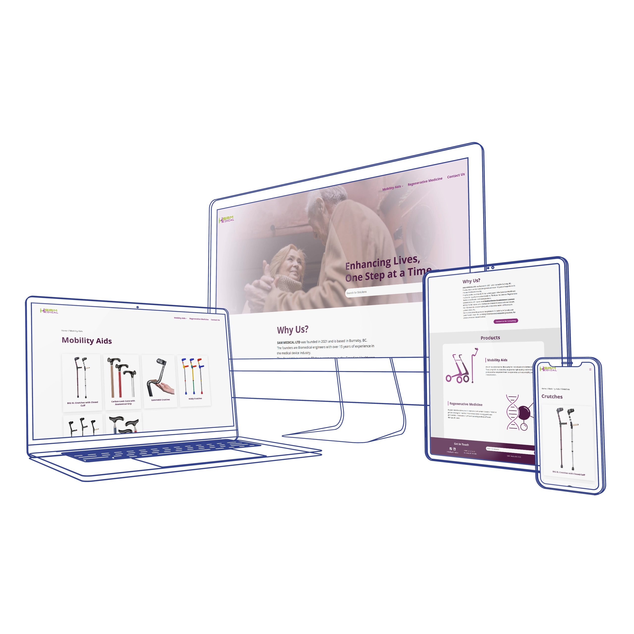
Ecommerce Design/Dev
UX/UI Case Study
UX Case Study