Digital Media
Projects
Brochure
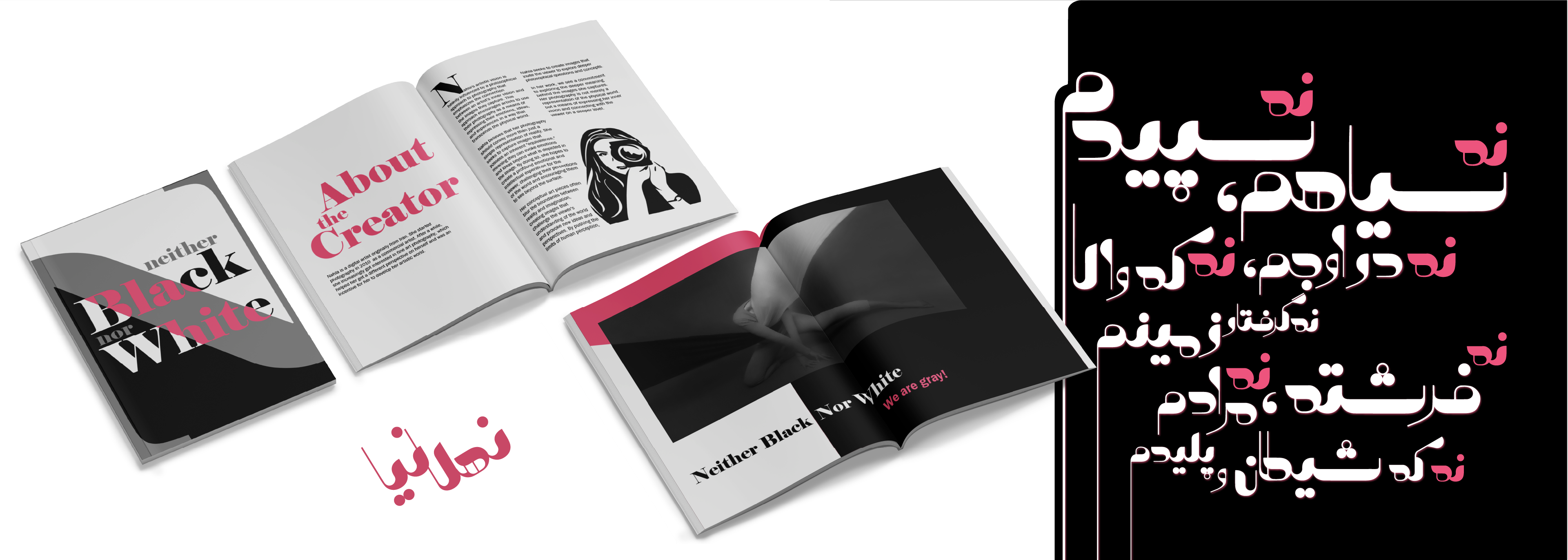
NahlaNiaI created a brochure to promote my solo exhibition called "Neither Black Nor White", which features a collection of my fine art photographs. To align with the theme of the collection, I designed the brochure in BW with a hint of my branding color. The typeface I used for the headings is high-contrast with curves and sharp angles and represents the difference between black and white. To ensure consistency in the design of a bilingual brochure, I took the initiative to create a new Persian typeface that matched the design of the existing English headings. This allowed for a more visually appealing and cohesive design.
Content
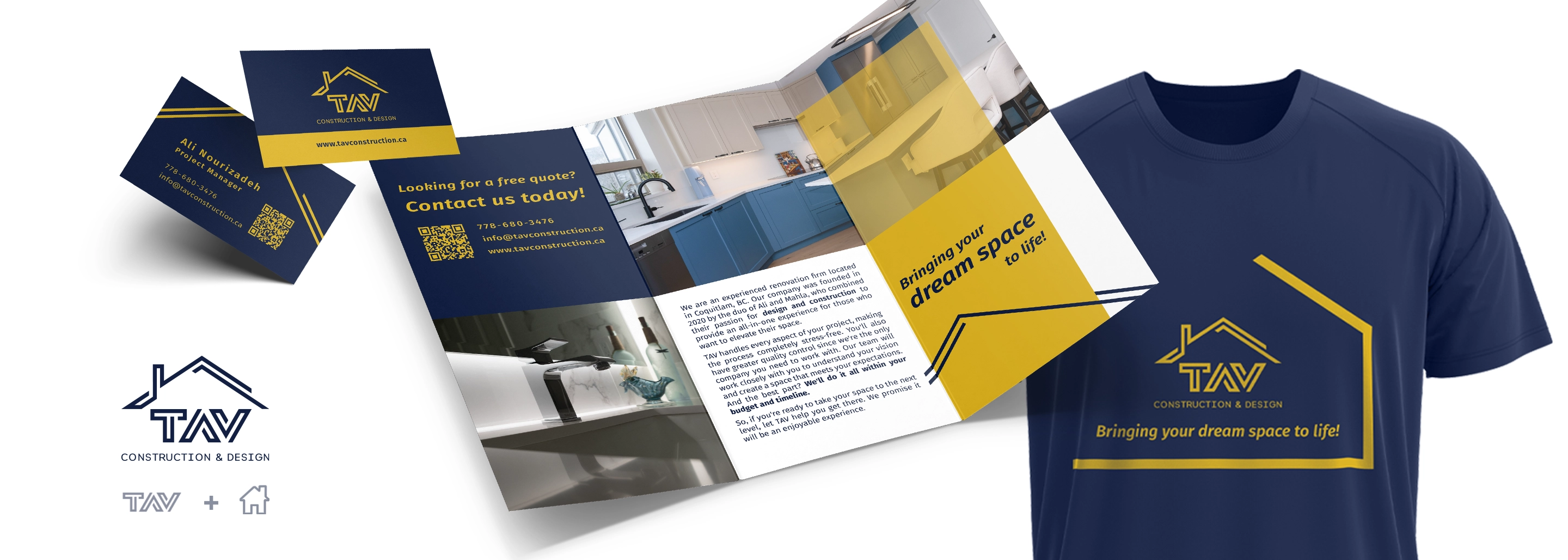
TAVI utilized a purposeful design approach to reimagine TAV's logo, a renovation company, in a way that retains brand familiarity. The logo now captures the essence of the brand and its specialization in transforming living spaces, while being more responsive to different devices and marketing materials with the addition of a house symbol. I also created a style guide that extends across various marketing assets, where consistent geometries and visual elements are used to create a cohesive and recognizable brand presence. Moreover, I create content from completed projects, regularly. This includes photo and video shooting/editing, and graphic design. The final works are displayed on the company's marketing touchpoints, including print collaterals, social media, and the website.
Brand Identity
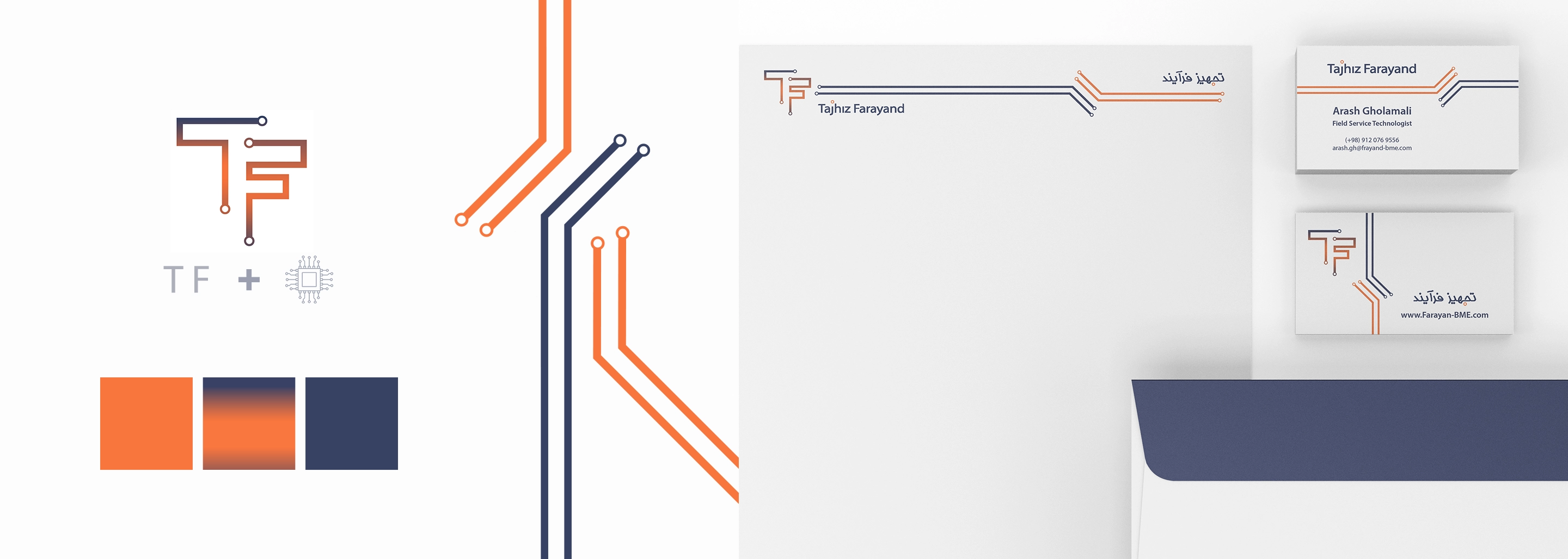
Tajhiz FarayandI took a cohesive design approach in crafting the branding components for Tajhiz Farayand, a startup MedTech company specializing in technical services for high-tech medical equipment. The logo fuses the company's initials into a dynamic arrangement resembling electronic circuits. I integrated the same geometric elements into all designed material to create a unified visual language across all touchpoints. The brand's professionalism, reliability, and forward-thinking are reinforced by its color choices. Navy blue signifies trust and stability, while bright orange represents vibrant energy and dedication to excellence in the industry.
Proposal Design
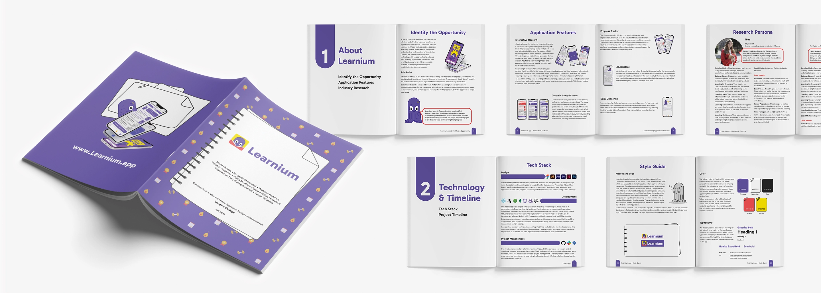
Learnium Mobile AppLearnium is a mobile application in the EdTech industry. As a UX designer, I collaborated with an agile team to design and develop the application from conceptualization to final delivery. To showcase the product to potential investors, I designed a detailed proposal to communicate design rationales and describe the end-to-end design process. I adhered to the branding and design guidelines established by fellow UI designers. I utilized or adjusted UI components to create a visually appealing and coherent presentation. Furthermore, I was responsible for writing the entire written content of the proposal, ensuring every detail was clear, concise, and compelling.
Photography
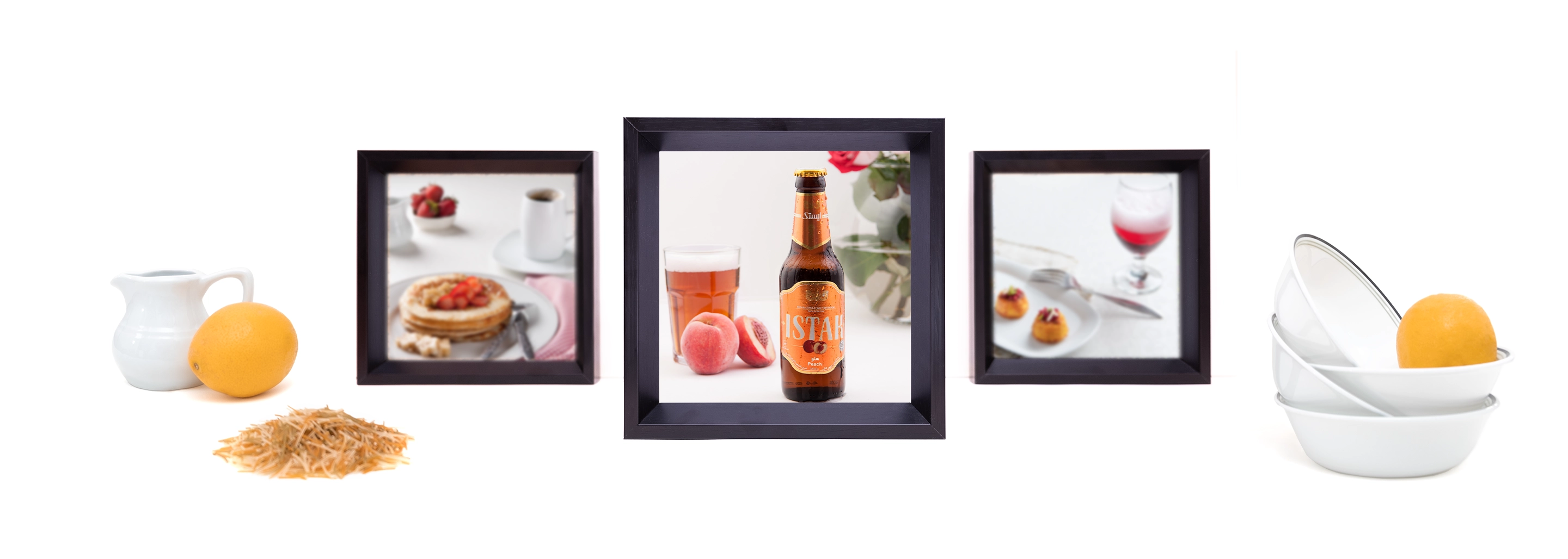
MagazinesIn addition to the commercial photography projects that I've performed individually, I collaborated with health and lifestyle magazines to create advertising content for their clients to be published weekly or monthly. My main focus has been on commercial product photography, where I've captured products, services, and the environment of a business, either in their location or the photo studio.
Label Design
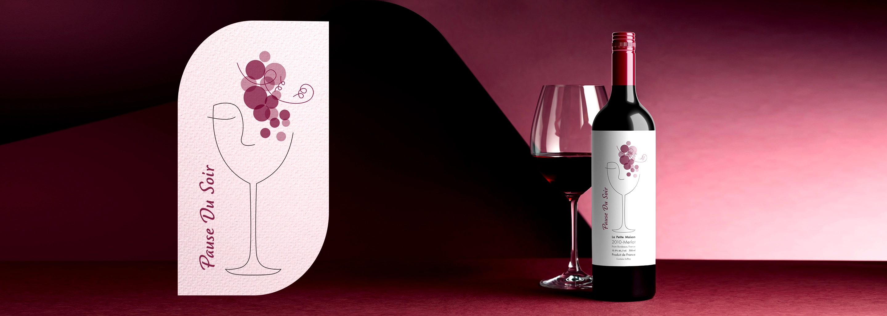
Wine BottleIn this design challenge, I drew inspiration from the evocative name "Pause Du Soir," which conveys images of tranquil evenings, shared moments, and serene gatherings. I intended to infuse a delicate yet inviting aesthetic into the design, evoking a sense of warmth and tranquility. Through thoughtful consideration of color, typography, and illustration, I added a feminine touch to my design to make it more approachable.