LinkedIn Learning
UX Design Study
Overview
LinkedIn Learning provides access to personalized course recommendations based on data-driven insights. Although the content recommendations on Learning are based on LinkedIn profile, groups, and connections, it's an independent application from LinkedIn. In this study, I reviewed the entire user flow on the mobile application and compared it with the web app to check consistency in UX. For redesign purposes, I only focused on My Learning flow and all its descendants.
-
 Impact
Evaluated the mobile application against the web app to identify inconsistencies. Suggested design improvements aimed at enhancing usability, streamlining navigation, and creating a consistent cross-platform experience, with the goal of improving task completion rate.
-
 Hats Worn
- I conducted survey, performed competitor analysis and heuristic evaluation, crafted persona and user journey map, recreated the original user flow and redesiged it, and finally delivered mid-fidelity wireframes.
-
 Tools
Tools
Figma for Design & User Testing
Google Forms for Survey -
 Timeline
3 Weeks, from Audit to Presentation
-
 Team
Team
Solo Work
-
 Platform
Mobile Application
User Research
For this study, my objective was to enhance the user experience of the LinkedIn Learning mobile application. I began by examining how easy it is for learners who use both the mobile and web apps to switch between them seamlessly. Another aim was to improve the overall experience for learners who frequently use the LinkedIn Learning mobile app, taking into account device limitations.
To answer this question, researching the solution space was necessary to know the real users' goals and pain points. However, since LinkedIn Learning has some bold competitors with a potential common user base, researching problem space could bring many valuable insights, as well.
For conducting research, surveys seemed to be an effective method as it allows access to a larger user population. The next step would be conducting interviews with learners who use LinkedIn Learning and other platforms. By asking attitudinal questions, I could learn about the frictions faced while switching between the website and application, and how their experience compares with LinkedIn Learning and other platforms. Another research method could be mapping the journey of real users to identify necessary modifications and potential new features. However, due to time and budget constraints, I conducted a limited survey and created a service design blueprint based on two user interviews.
Survey
In a limitted survey I gathered answers from 6 learners. The purpose of this survey was to identify the pain points and users' goals where I asked the questions in the following areas:
- Discovering proper courses on LinkedIn Learning
- Criteria to choose a course to take
- Frequently-used features
- Experience of switching between web app and mobile app
- Overall experience compare to other learning platforms
Persona

I’m shaping my future step by step & I need an accessible learning supplement to improve my professional skills.
22 Years Old
Highlights
- Education: Bachelor's degree student in Marketing
- Occupation:A part-time junior digital marketing specialist who is looking for a higher job position
- Tech familiarity: Tech-savvy in using different apps and websites
Applications
 Coursera
 HubSpot
 G Analytics
 LinkedIn
Frustrations
- While I’m on a bus, I don’t have access to my notebook to take note of a course
- English is't my first language and I sometimes don’t quite understand what the instructor talks about
- The vast course library on LinkedIn Learning can be overwhelming
- I usually take a few courses at the same time. Finding the chapter I left is not that simple
Core Needs
- I'm aiming to supplement my academic learning with practical skills for employability
- I’d like to make the best use of resources that are available to me as a student
- A seamless learning experience with engaging content and efficient tools is a priority
- I’d like to be productive while I’m on public transport to university or my workplace
- I’d like to have a consistent experience when I switch to a mobile application from desktop version
- I want to be able to categorize the courses I already passed for the future reference
- I sometimes need to switch from one course to another. I’d like to see my progress on all active courses clearly
- The instructor’s reputation is important to me. I’d like to learn from influential people in the industry
- I’d like to know how marketing experts think about a course before get to start that
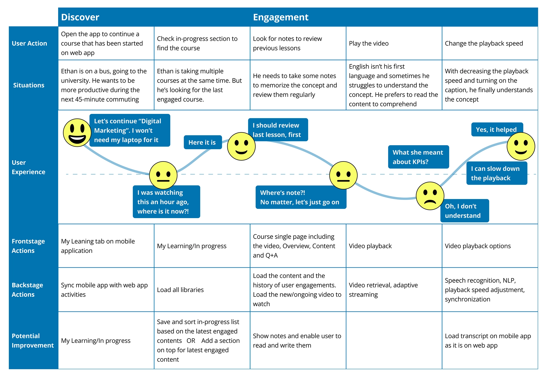
User Journey Mapping
After conducting interviews and surveys, I created a persona to redesign the application based on the users' needs. To better understand the users' experience, I mapped out their journey and identified areas of frustration when using the app. This allowed me to empathize with the users and make improvements where necessary.
Heuristic Evaluation
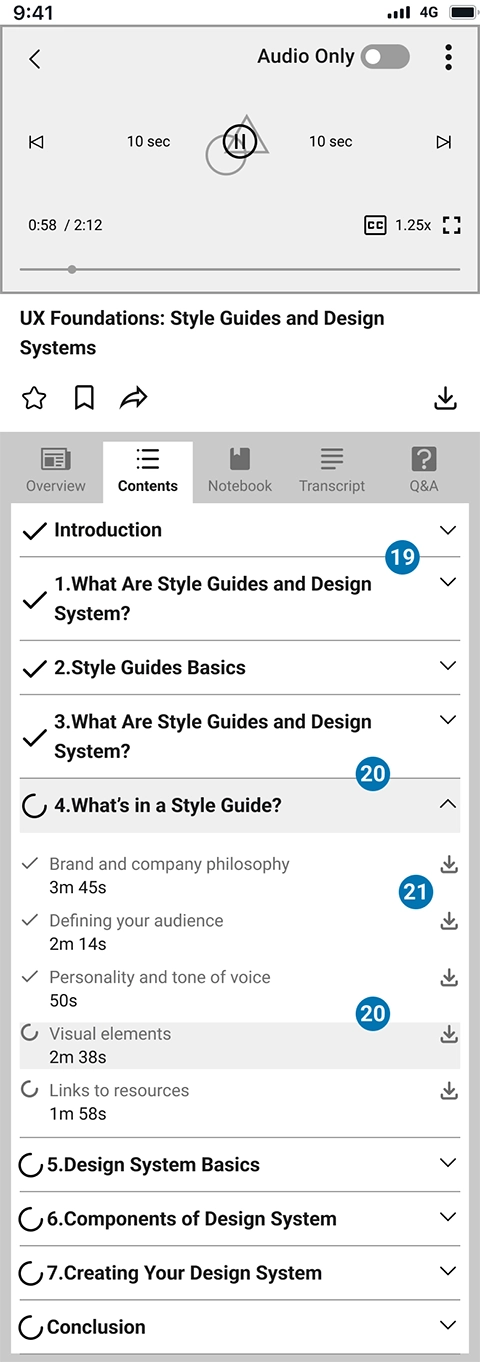
After conducting a thorough examination of the application on both mobile and web platforms, I have identified some key areas that require improvement. In particular, the section entitled "My Learning" was the focus of my analysis regarding the application's redesign.
In the original design, some features such as "Audio only" are targeted towards mobile users, taking into account their device and network limitations. However, there are still some features that are only available on the website, which could pose a problem for users who rely on the app to learn while on the go. Therefore, it is important to ensure that all necessary features are accessible on both platforms.
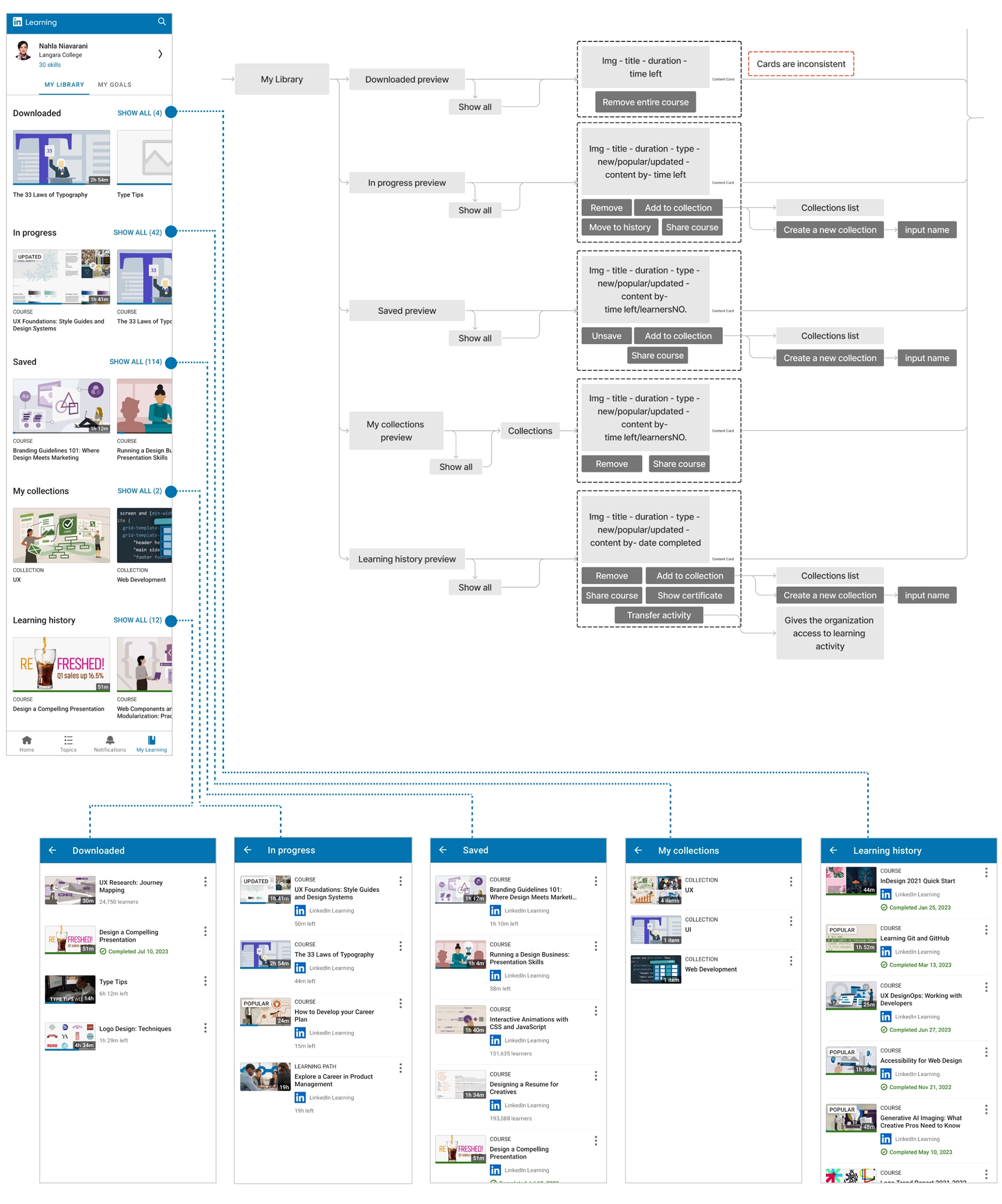
Upon analyzing My Learning/My Library, I noticed a lengthy list of collections. It seems that the content and order of these collections are subject to change regularly. While this dynamic listing is necessary for sourcing relevant content, the constant changes in ordering and displaying them in an long list can be confusing to users.
Another issue I discovered is that each action on the application involves multiple, unnecessary navigations. This can lead to confusion and frustration for users. To address this, combining pages and functions in some cases could result in a more efficient and user-friendly interface.
Additionally, integrating settings and preferences from LinkedIn profiles into the learning app can make it confusing for users. In some instances, an action takes the user to the LinkedIn application without giving notice and providing a way to return to the Learning app. Therefore, it's important to treat LinkedIn Learning as an independent application.
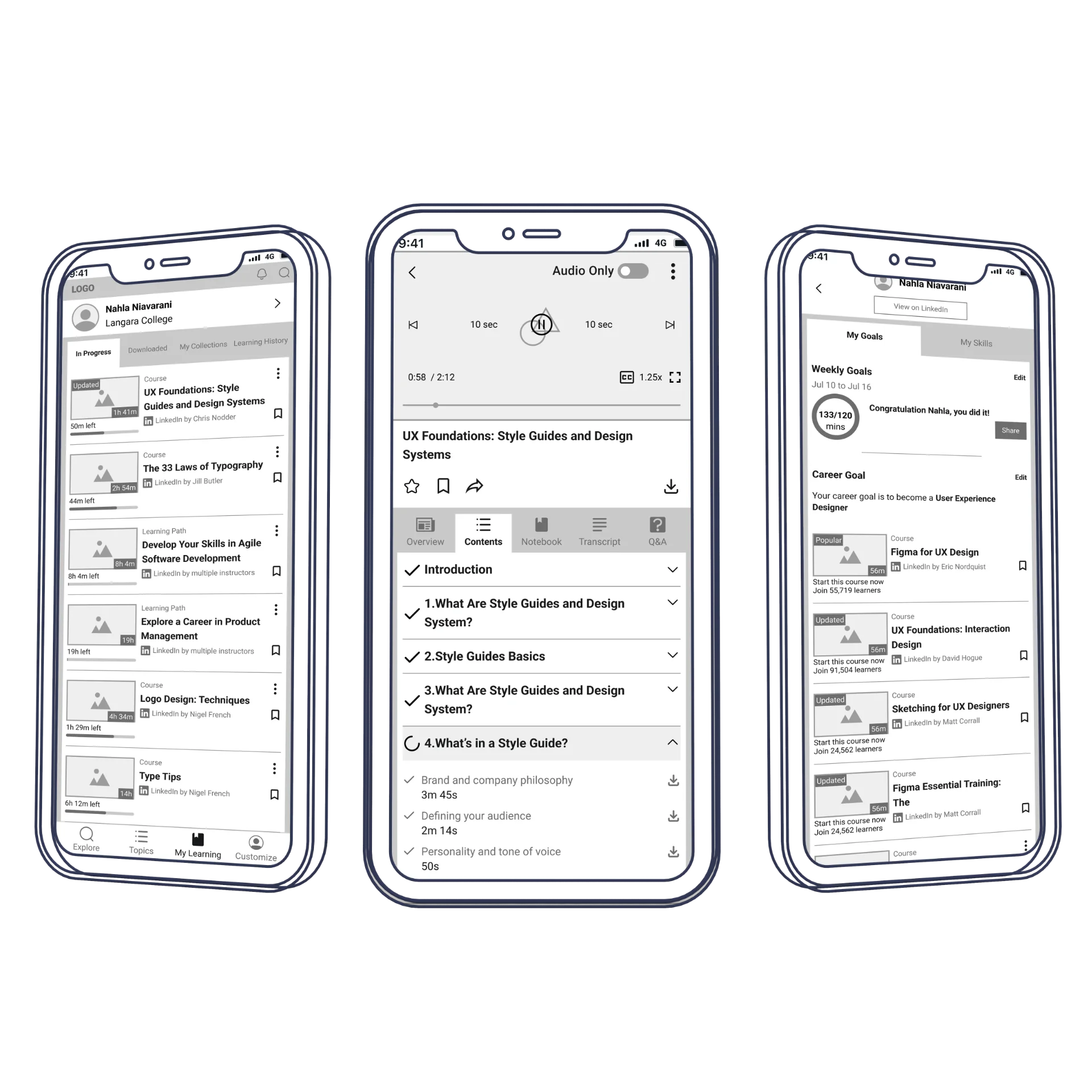
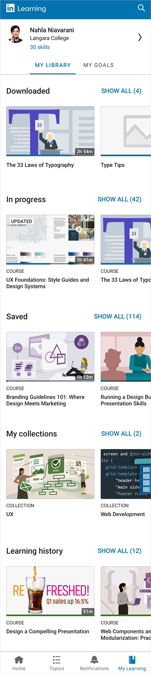
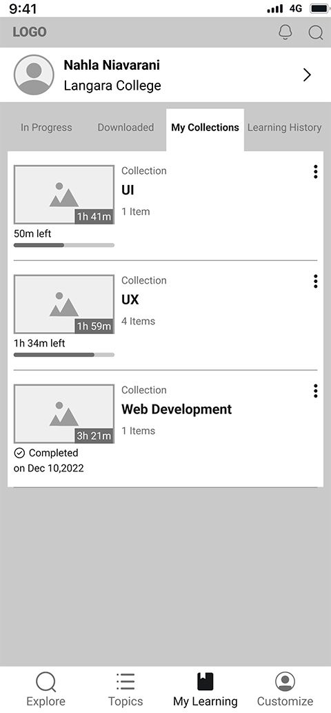
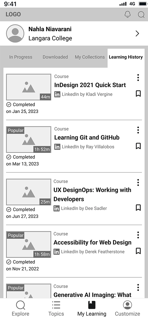
My Learning/My Library
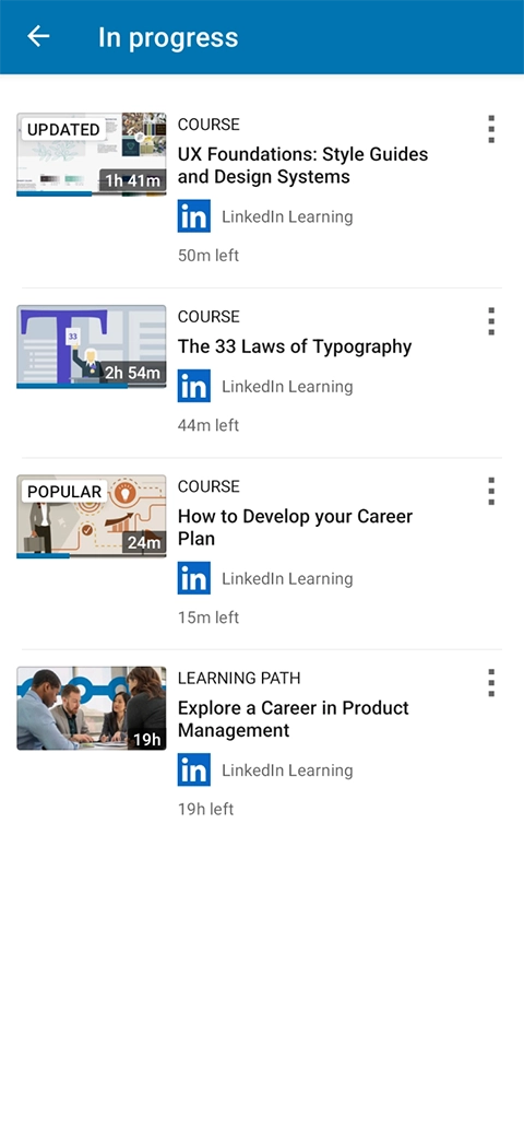
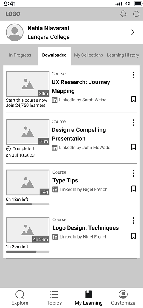
My Learning/My Library is the main page that users regularly use to continue their learning process or to start a new course from saved options. In the heuristic evaluation, I noticed the following:
- There are five categories in this page and to explore the full list of each, the user needs to navigate to another page
- The page is long and the final categories can be easily missed
- A better placement for “My Goals” can be profile section, where the skills are also displayed
- Cards are inconsistent in different categories of “My Library”
- The functions which are available for content in the cards are different. For instance, in downloaded courses, the only available function is removing downloaded file
- The learning progress can be more clear in any specific course
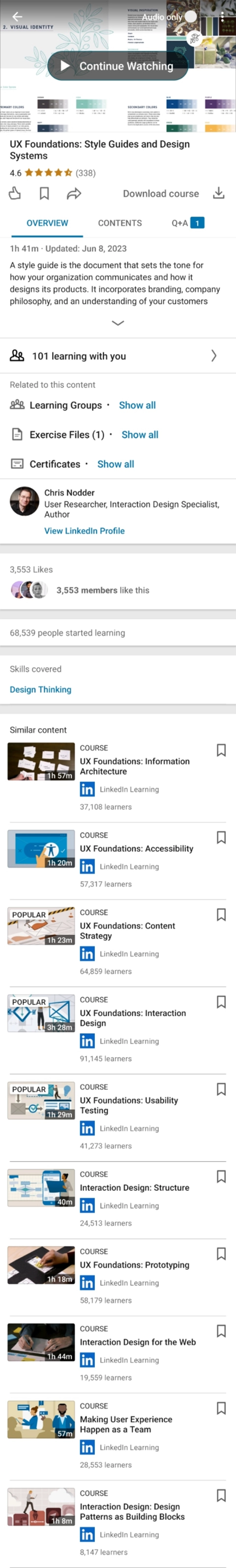
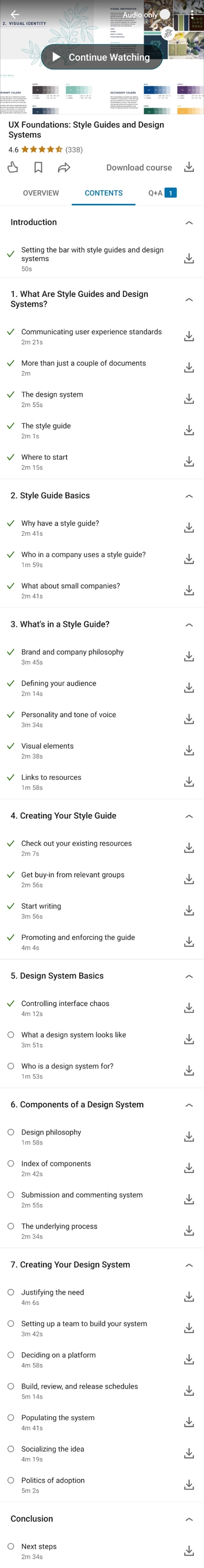
Course Full View
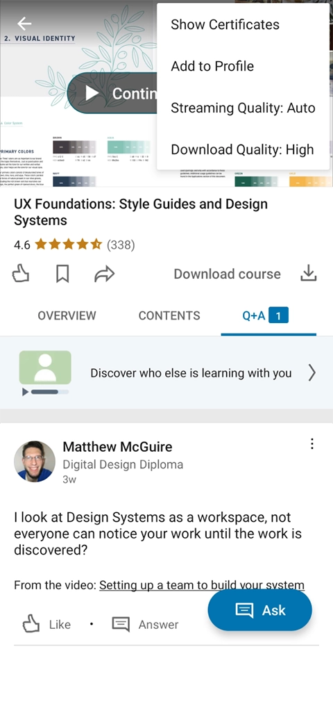
The Course Full View is where users interact with course and all its available options. During the heuristic evaluation, I observed that there is significant inconsistency between the web app and mobile app in this flow. To better understand these differences, I compared side-by-side screenshots of the mobile and desktop versions.
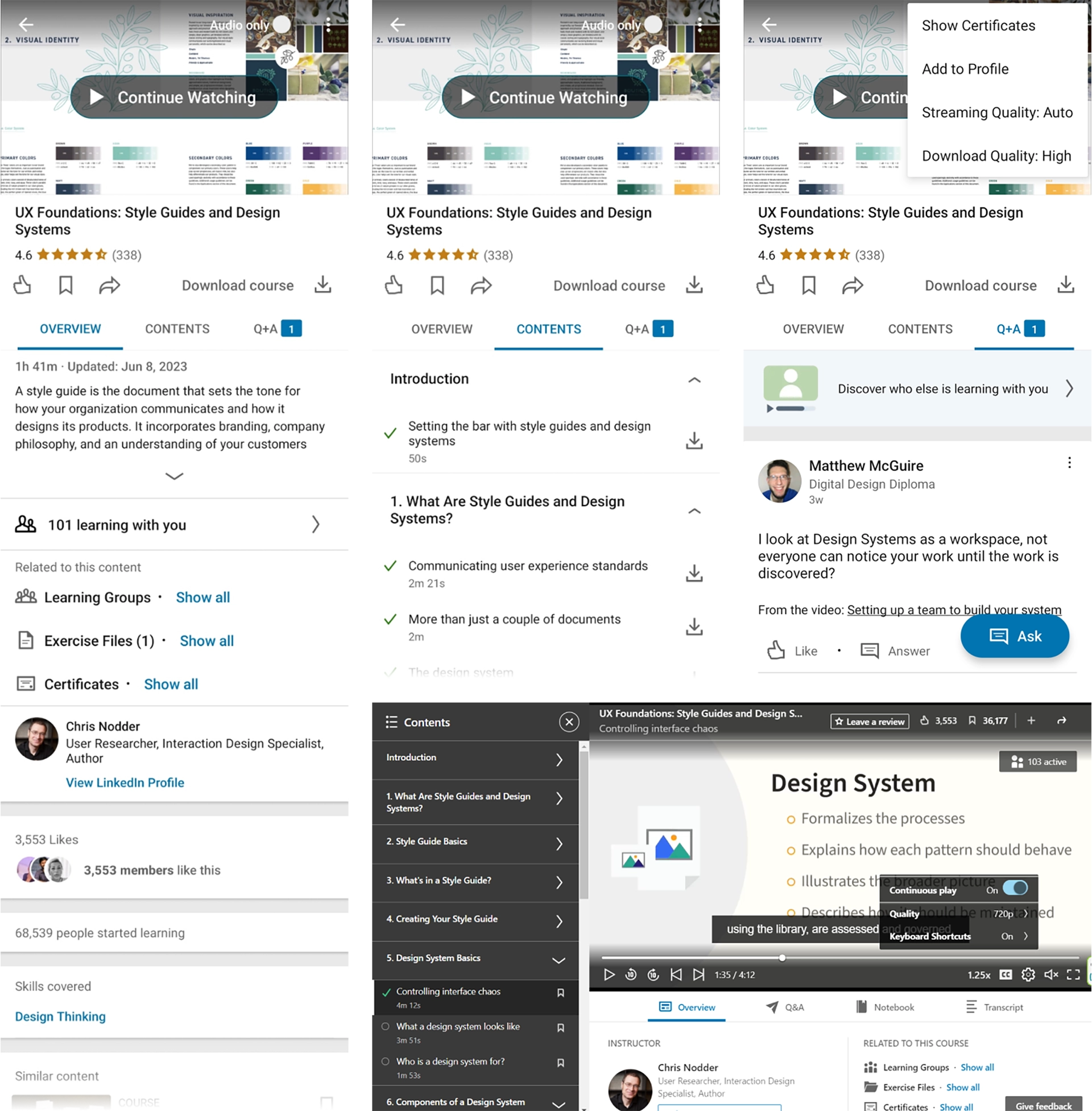
- The hierarchy is different on the app and the website
- Some features such as “Notebook” and “Transcript” are only accessible on website while for a learning application which might be used while commuting, those features are necessary on app.
- “Show Certificate” and “Add to Profile” are always shown as active, while only after finishing the course they are functioning
- The remaining time is not visible
- Currently playing content/chapter is not prominent
- Changing the streaming/download quality changes the settings in preferences, not just the current video
- User can’t read/write reviews or rate the content on app
- The presence of both a “like” function and a "review and rating" system can be confusing for users, who may not know which one to rely on when choosing a course
User Flow
In the redesign process, the first step that I took was modifying the user flow to create a more consistent user experience between the mobile app and the web.
View on FigmaMy Learning
- To simplify the navigation through the application, I combined pages and functions in some cases. For instance, “Saved” and “My Collections” are combined, since they share the same functionality.
- I integrated "My Goals" with the profile, where skills and other related sections are accessible.
- The hierarchy is changed and “In Progress” is the first library that is shown, now.
- One extra click is diminished by showing the library in the form of tabs. Now to see the full list, the user doesn't navigate to a new page and returns to the library
- All cards, regardless of their library, have a common style and components
- All cards, regardless of their library, have the same actions, showing as a small overlay by clicking on three dots. “Show Certificate” and “Transfer Activity” are only active when the course is completed
- This allows users to save content to more than one collection
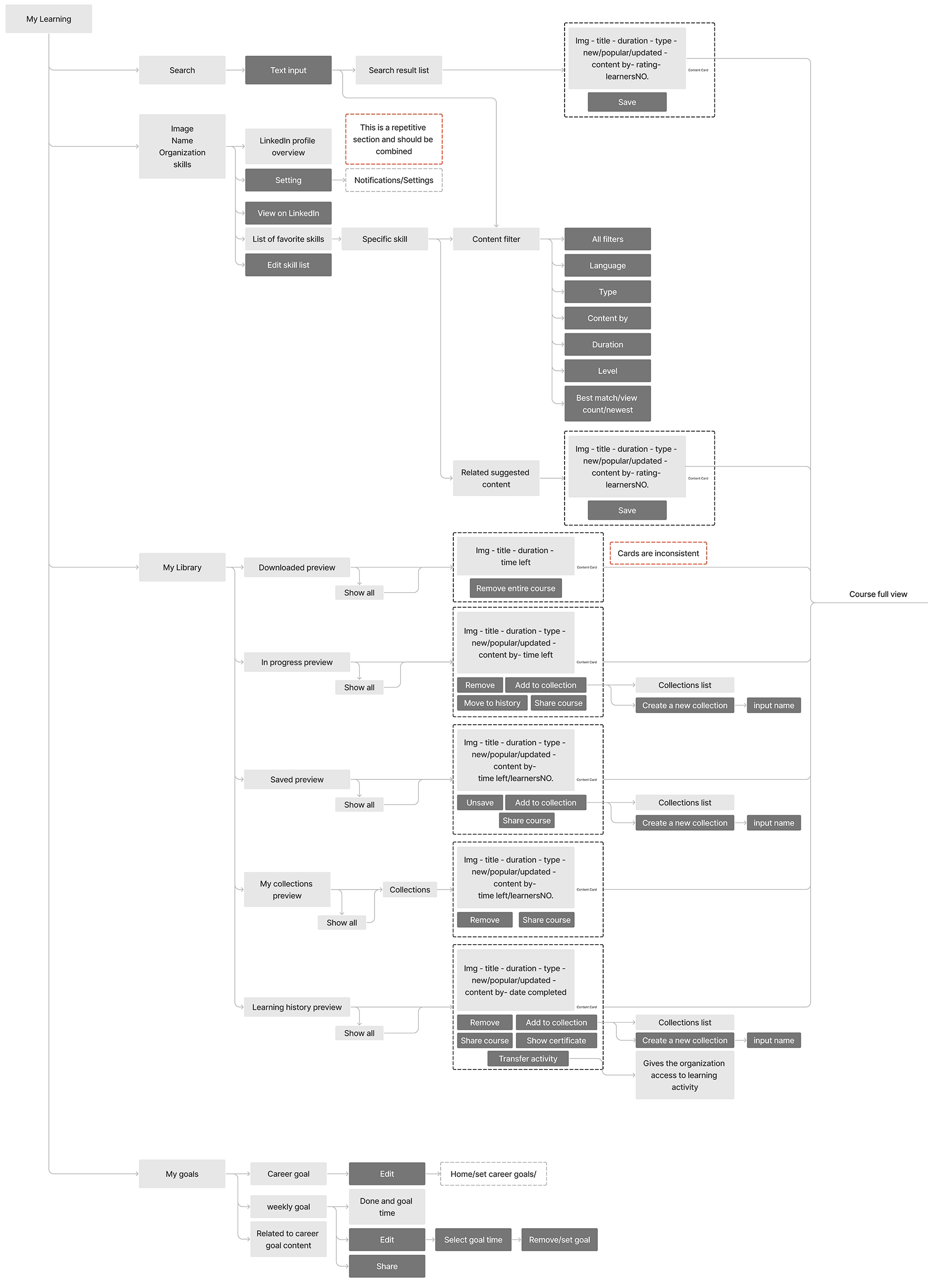 Original User Flow
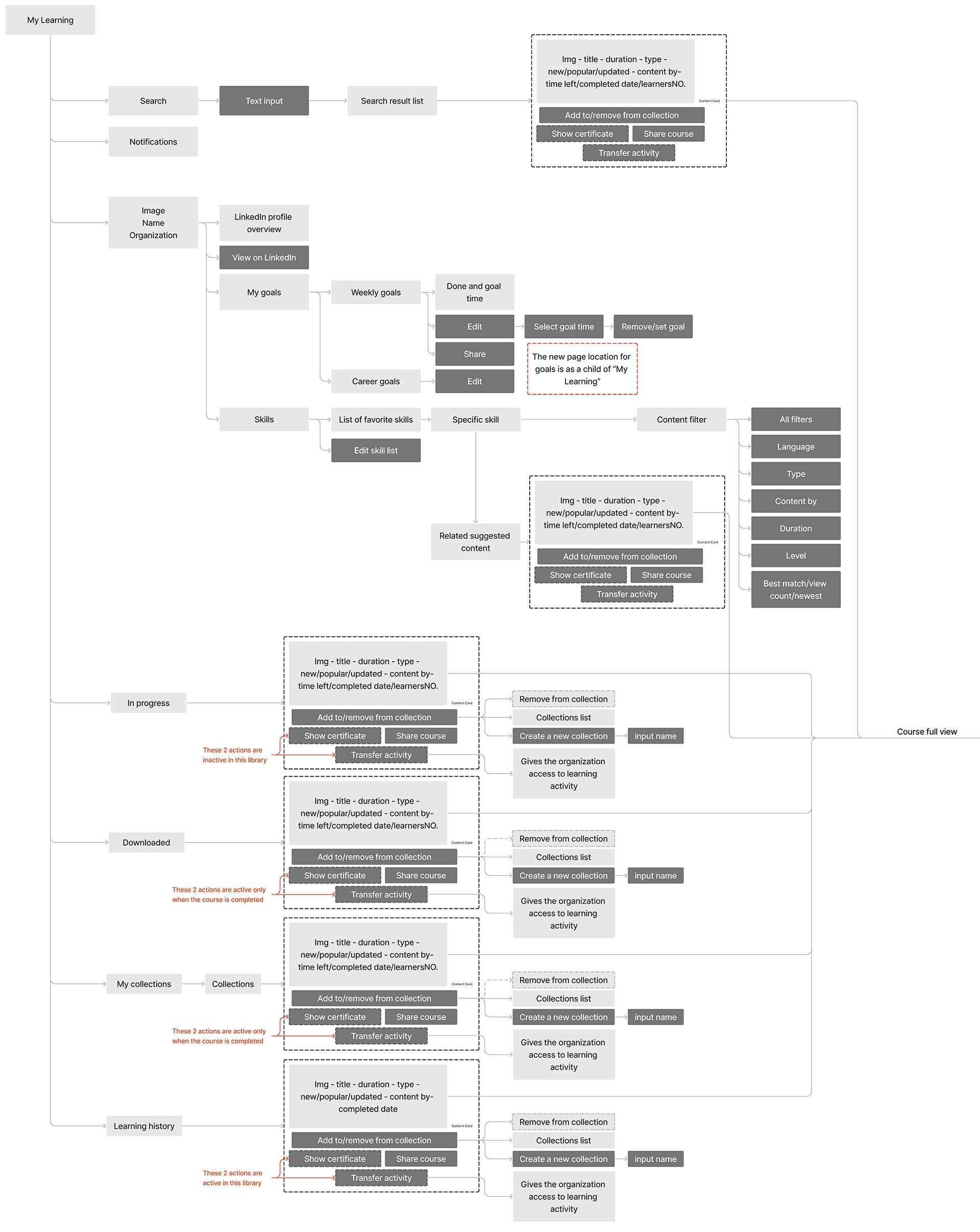 Redesigned User Flow
Course Full View
- In the current version “Notebook” and “Transcript” are available on the website, only. To create a consistent experience I added them to the mobile app.
- In the current version of the mobile app, only the course rate is visible on the course full view and the user can't rate or review a course. I added this feature to the mobile app user flow.
- In the redesign, the buttons such as "Certificate" and "Add to Profile" are active only when the course is completed successfully.
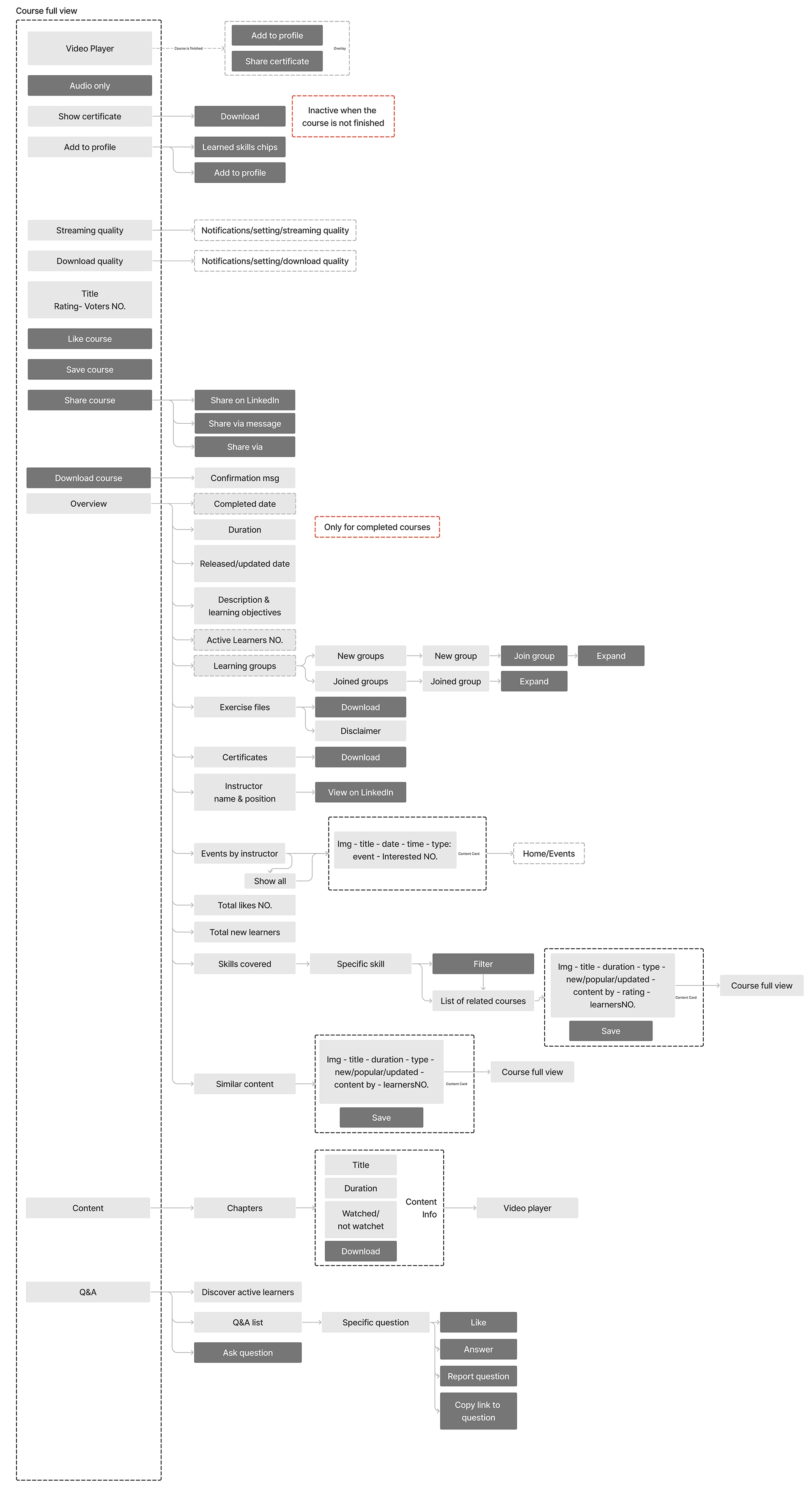 Original User Flow
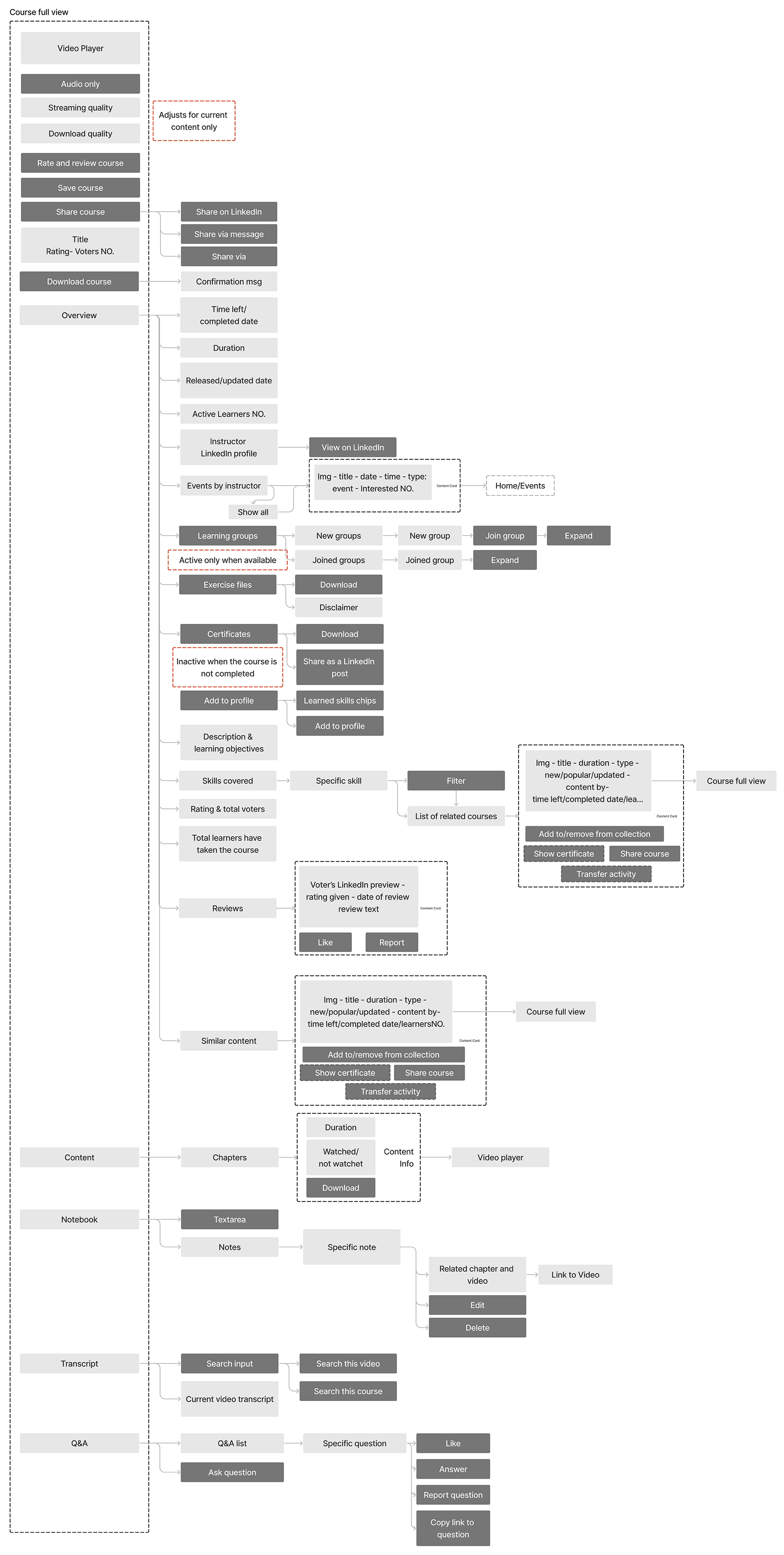 Redesigned User Flow
Wireframe
Continuing the redesign process, I created wireframes for My Learning flow and all its descendent pages.
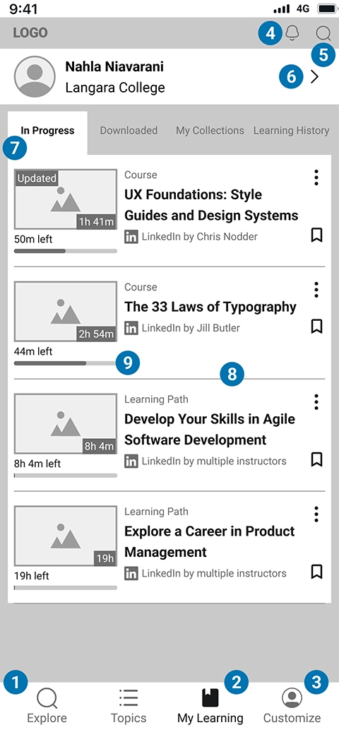
My Learning
Here I demonstrate the original design and the redesign for the "My Learning" main screen. Since I categorized collections as tabs rather than a list, the main screen is the first collection which is "In Progress", in this case.
Wireframe Annotations
- “Home” is replaced with “Explore” to give a better context about the page
- “My Learning” is showing as the third navigation item
- Another navigation item in the original version is “Notifications”, which mostly includes settings and preferences. In the redesigned version, “Setting” is shown as “Customize” in the navigation menu
- “Notifications” is separated and is shown up on the header
- The “Search” button in the header is available on all pages
- All settings related to the goals and the skills are now shown on a separate page
- “My Library” is organized in tabs. This section is dynamically sticky and by scrolling is shown on top of the page and after the header
- All cards, regardless their library, have a common style and components
- This section is related to the time left of a course/learning path. In this case course is already started, but not completed. The progress bar shows the percentage of watched
- “Saved” and “My Collections” are combined. Since two categories for the same function make users confused and should be integrated
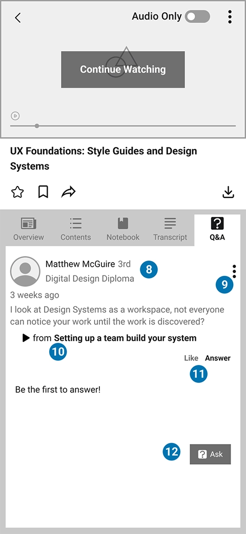
Course Full View
Here I demonstrate the original design and the redesign for the Course Full View. Since I added "Notebook" and "Transcript" to the mobile app, two tabs are added to this screen.
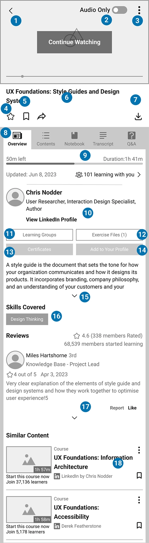
Wireframe Annotations
- Goes back to the list
- Turns off video and only plays audio
- A small overlay opens to adjust stream and download quality for this video only
- Clicking on star opens an overlay to rate the content and write a review
- Opens an overlay to select a collection or create new collection to add the content to it
- Opens an overlay for selecting share method: “Share on LinkedIn”, “Share via private message”, and “Share via”
- Downloads the whole course
- The categories are shown as tabs
- The total duration and time left and a relevant progress bar is shown
- Instructor’s info and link to LinkedIn profile
- Opens a new page to show related learning groups. It’s inactive if there’s no group
- Opens a new page to show related exercise files. It’s inactive if there’s no file
- Opens an overlay to show certificates list. Certificates can be downloaded or shared as a LinkedIn post. It’s inactive if the course isn’t completed
- Shares the certificate on LinkedIn Profile. It’s inactive if the course isn’t completed
- Course info is expandable
- List of skills that are covered in course. Clicking on each skill opens a search result
- Rating and reviews. It’s expandable
- Other recommendations with standard card
- In content tab, chapters are separated by line. The watched chapters have a checkmark and are collapsed
- The playing chapter and video are shown with a BG color and a snipper besides
- Each video can be downloaded, alone
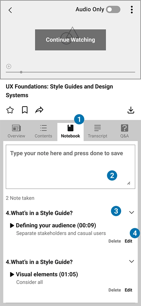
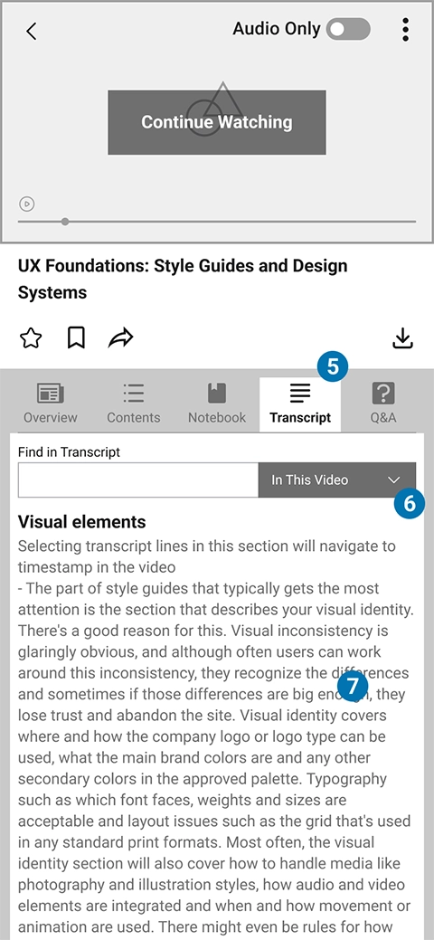
"Notebook" and "Transcript" are two tabs that are added to the mobile app to make it consistent with web app and create a more accessible experience for mobile users:
Wireframe Annotations
- In current version “Notebook” is available on website, only. In Redesign it’s added to app
- Textarea to write Note. Pressing “Done” on keyboard creates the note
- Note is created on the same chapter and video which is playing/active while noting
- Note can be edited or deleted
- In current version “Transcript” is available on website, only. In Redesign it’s added to app
- Searches the input text either in the current video or in the course
- Playing video transcript
- Commenter’s LinkedIn information
- Opens an overlay to copy the comment’s link or to report the comment
- Shows the video on which the comment is placed & it’s a link to play that specific video
- Like or answer the comment
- Floating button for opening an overlay to write the question
Reflections
Lesson Learned
- Seeing beyond the surface:
Conducting the heuristic evaluation sharpened my ability to spot subtle usability issues that often go unnoticed. I realized how even mature digital products can fall short in areas like platform consistency and intuitive navigation. I also discovered that excessive navigation layers create unnecessary friction, especially for mobile users looking for quick and efficient access to content.
If I Had More Resources
- Growing Through Feedback:
Looking back, one thing I could have done better is supplementing my heuristic analysis with direct user feedback. Interviews or usability tests would have validated my observations and uncovered pain points I might have missed. Furthermore, prototyping some of the proposed solutions could have added depth to my redesign and demonstrated the potential improvements more clearly.
See More of My Work
Tax Optimization SaaS
Enterprise Service Design
Analytics Web-App Design
Mobile App Design
Ecommerce Design/Dev
UX/UI Case Study